Terre Products is a manufacturer of high-quality replacement parts for outdoor power equipment, specializing in pulleys, belts, motors, and related components.
Project Type:
Packaging
Target Audience:
Tractor Supply customers, usually men who would fix their own small motor and Farmers.
Between all the version of packaging and all the box sizes I sent over 100 proofs during this project.
Terre Drive Pulleys Packaging Redesign
PROJECT BRIEF
Terre Products is a manufacturer of high-quality replacement parts for outdoor power equipment, including pulleys, belts, motors, and related components. When they approached us, they were gearing up for a major opportunity: a pitch to get their products into Tractor Supply Co. While they had a solid line of products, they lacked a unified visual identity across their packaging. Their current boxes were inconsistent and visually underwhelming—making it difficult for both retailers and customers to quickly identify and understand what was inside. Terre had previously worked with another design firm but felt the results were too generic and didn’t reflect the quality or potential of their brand. They needed a fresh, professional look—something clear, confident, and retail-ready that would stand out on the shelf and make a strong first impression.
Listening, Research, and First Drafts
DESIGN CHALLENGES
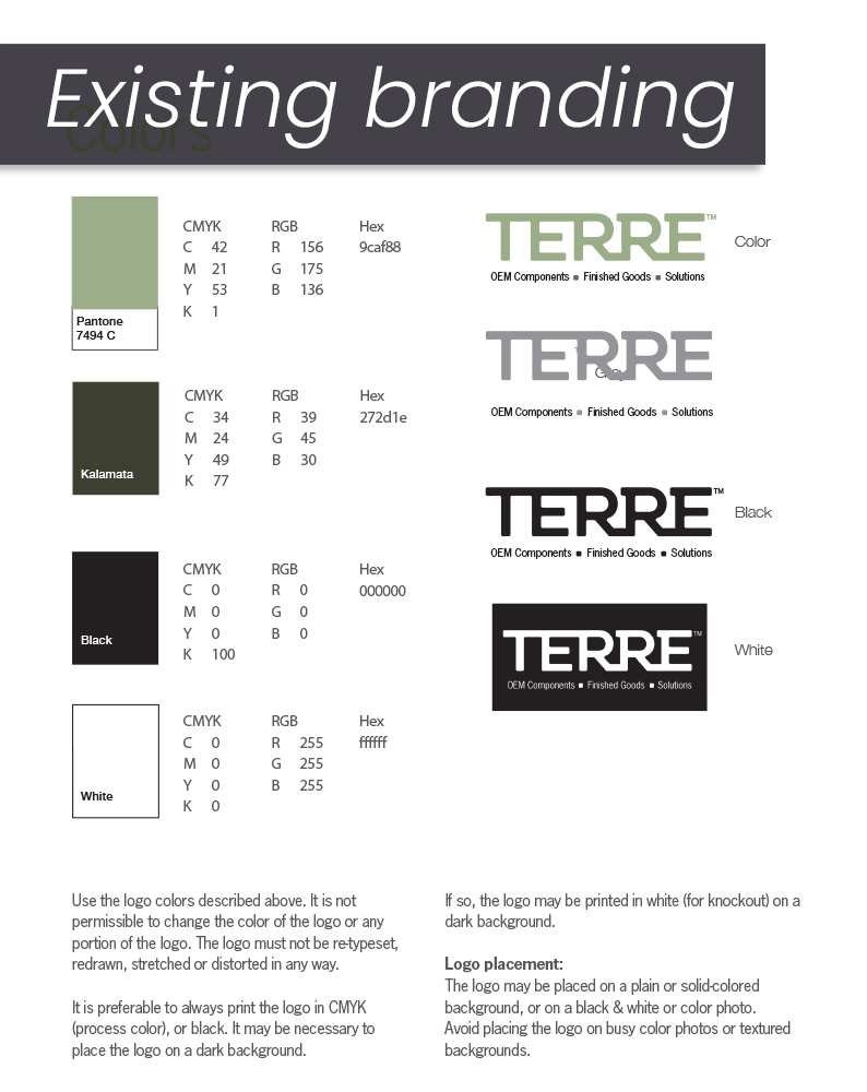
We kicked things off by sitting down with the Terre team to understand their goals and audience. The packaging had to be clear, concise, and functional—appealing to Tractor Supply’s customer base, which values straightforward, no-nonsense design. They liked dark text on white backgrounds, and wanted to keep a visual shorthand (small house-shaped symbols) their previous designer had used to show part dimensions.
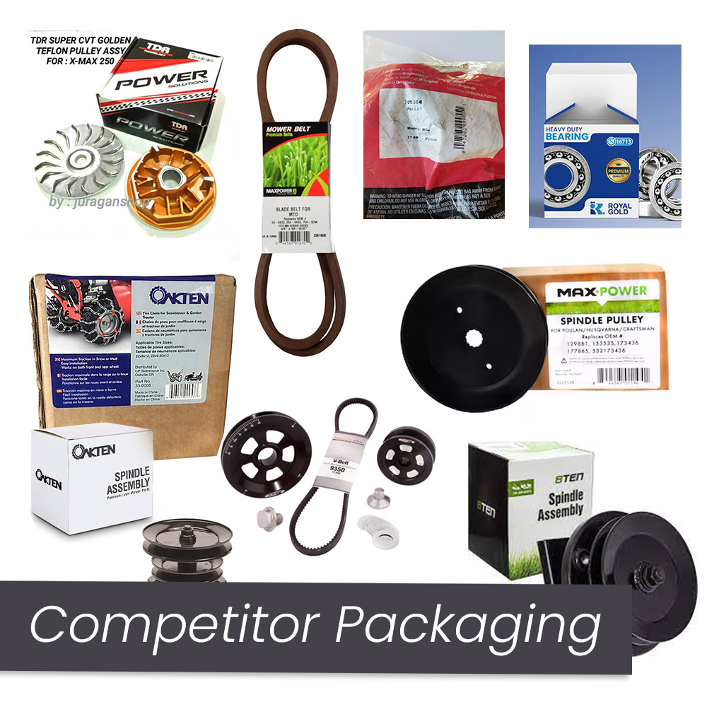
Terre already had a clean, minimal brand identity with a solid logo and color palette, but their packaging needed to do more. We began with a competitor analysis, focusing on brands like 8TEN, OakTen, and MaxPower. Most packaging in this market was either overly simple or practically nonexistent. Many competitors included grass textures and hard-line accents, especially on smaller parts like lawn mower pulleys.
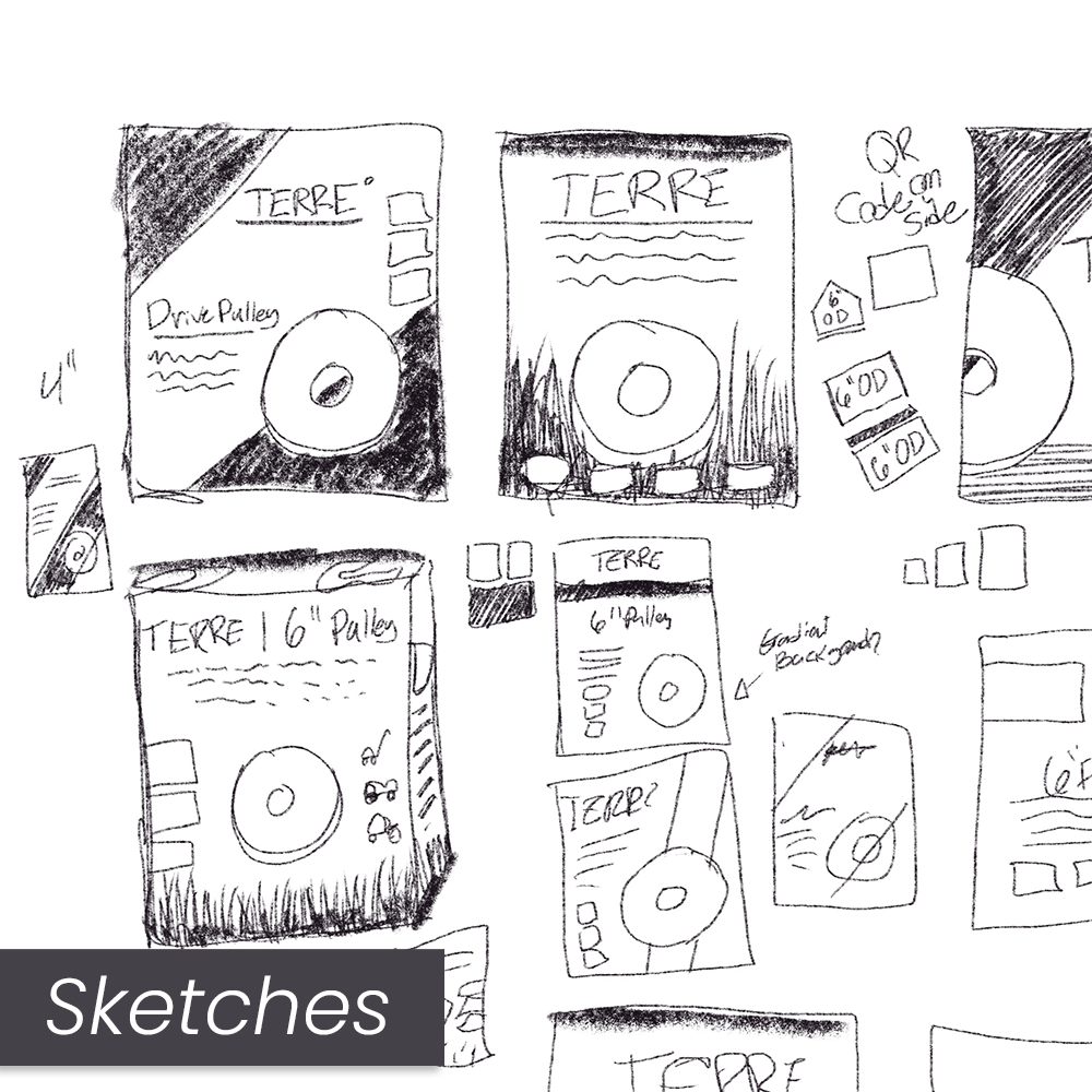
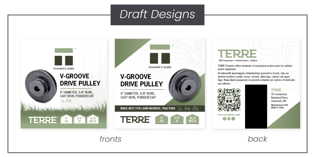
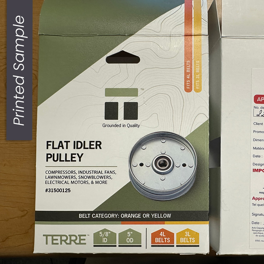
Our team of three designers each presented two concepts. I created a clean, structured layout with the product front and center, and the specs clearly grouped below. One version featured grass, but the stronger concept—with bold diagonal accents and simplified, intuitive information hierarchy—was chosen by the client.
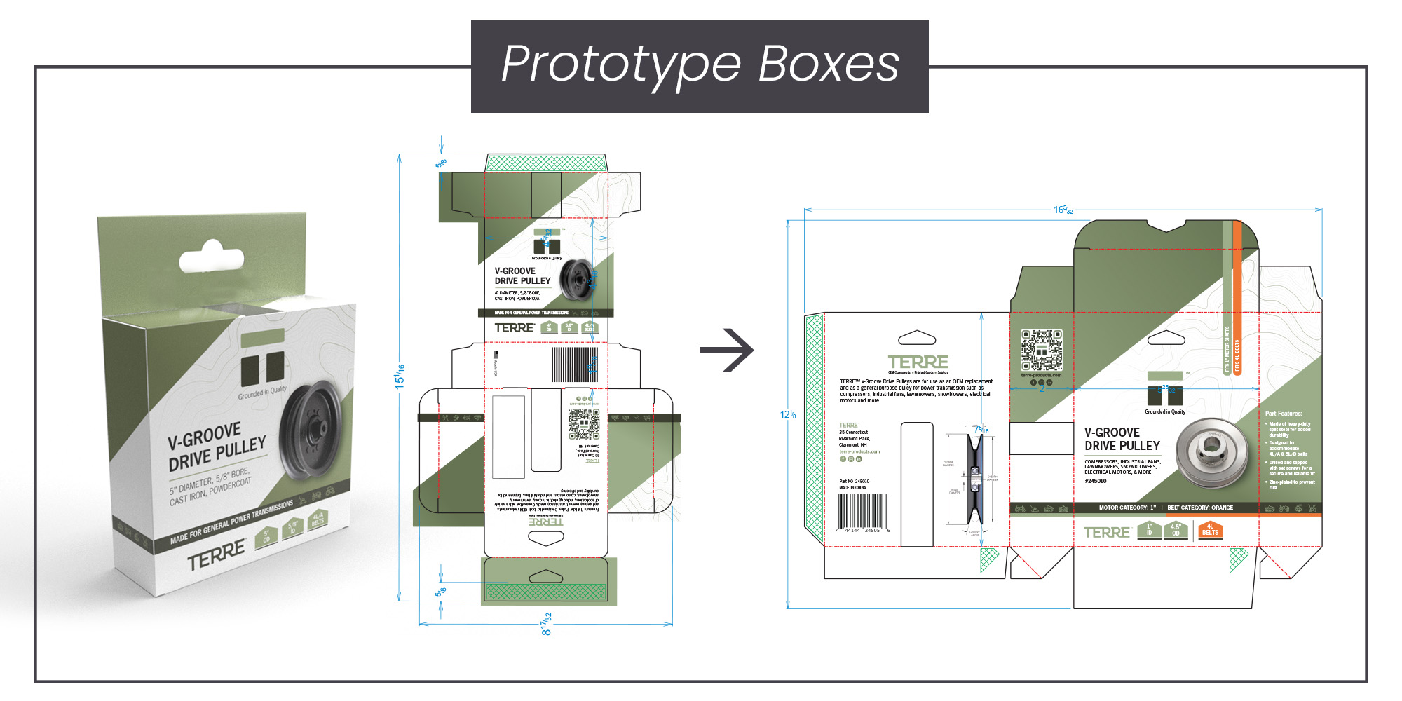
Prototyping & Packaging Engineering
Design Solutions
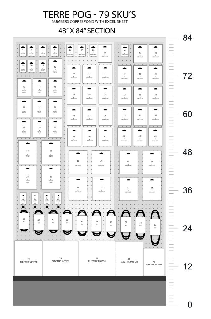
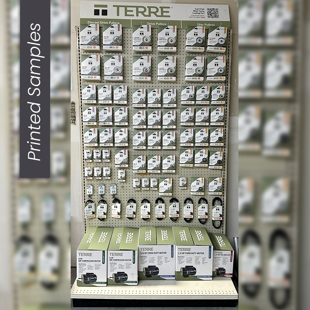
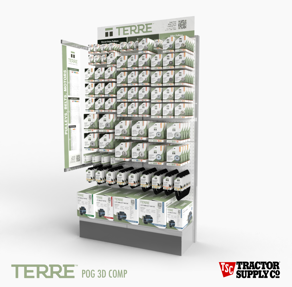
Our first packaging run included three pulley box sizes and a hanging tab design. However, early on, we pivoted to a more cost-effective box that could hang cleanly and stack on shelves. Before moving into printed proofs, I created a full-size planogram (POG) to scale, making sure everything would display correctly in-store.
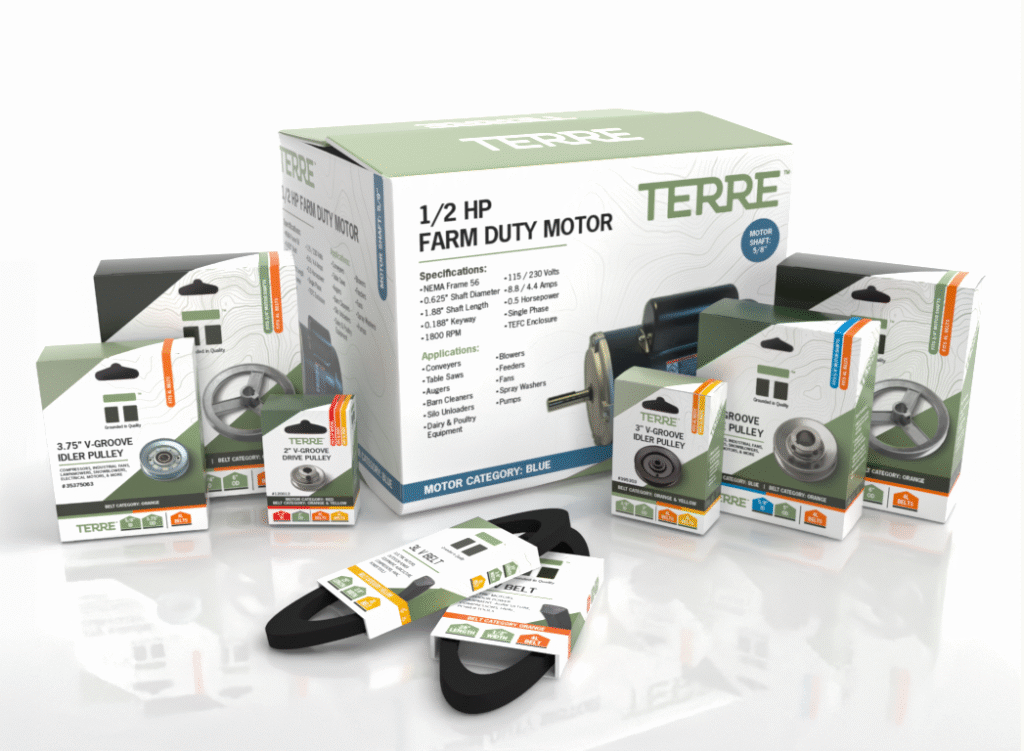
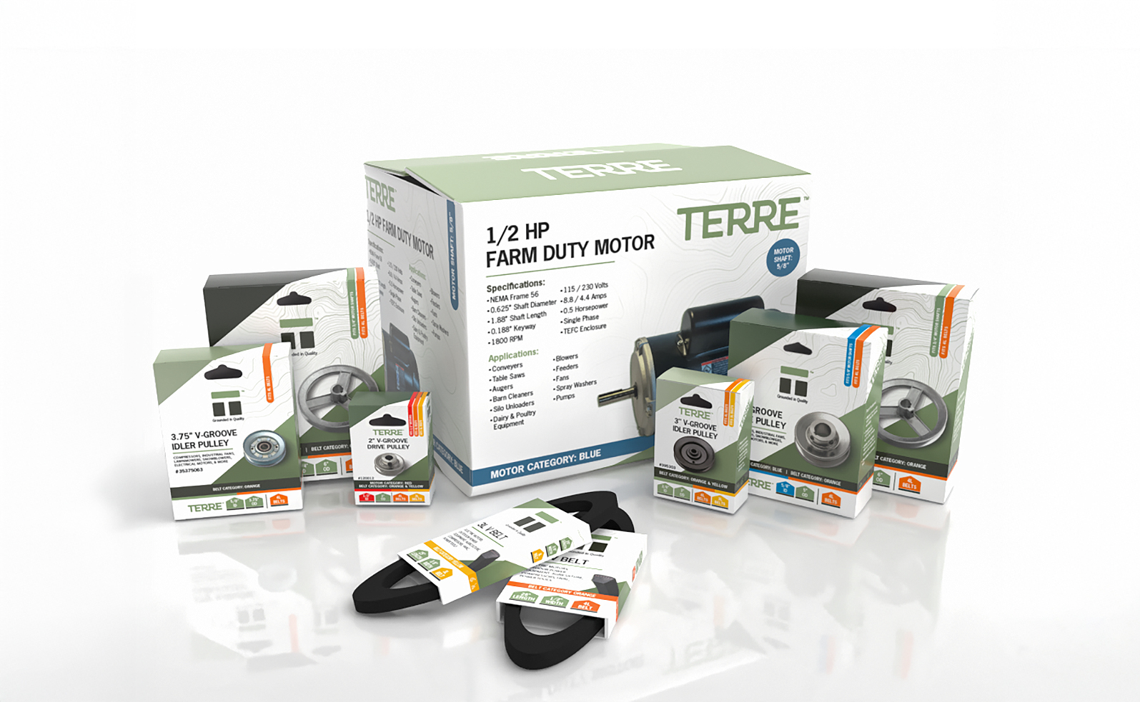
During this phase, we ran into a sizing challenge. With only three pulley box sizes and one belt size, certain parts didn’t sit well—like a 2.5″ pulley in a 4″ box, which caused the box to tilt. We adjusted by adding two new pulley box sizes and a wider belt box to accommodate longer belts.
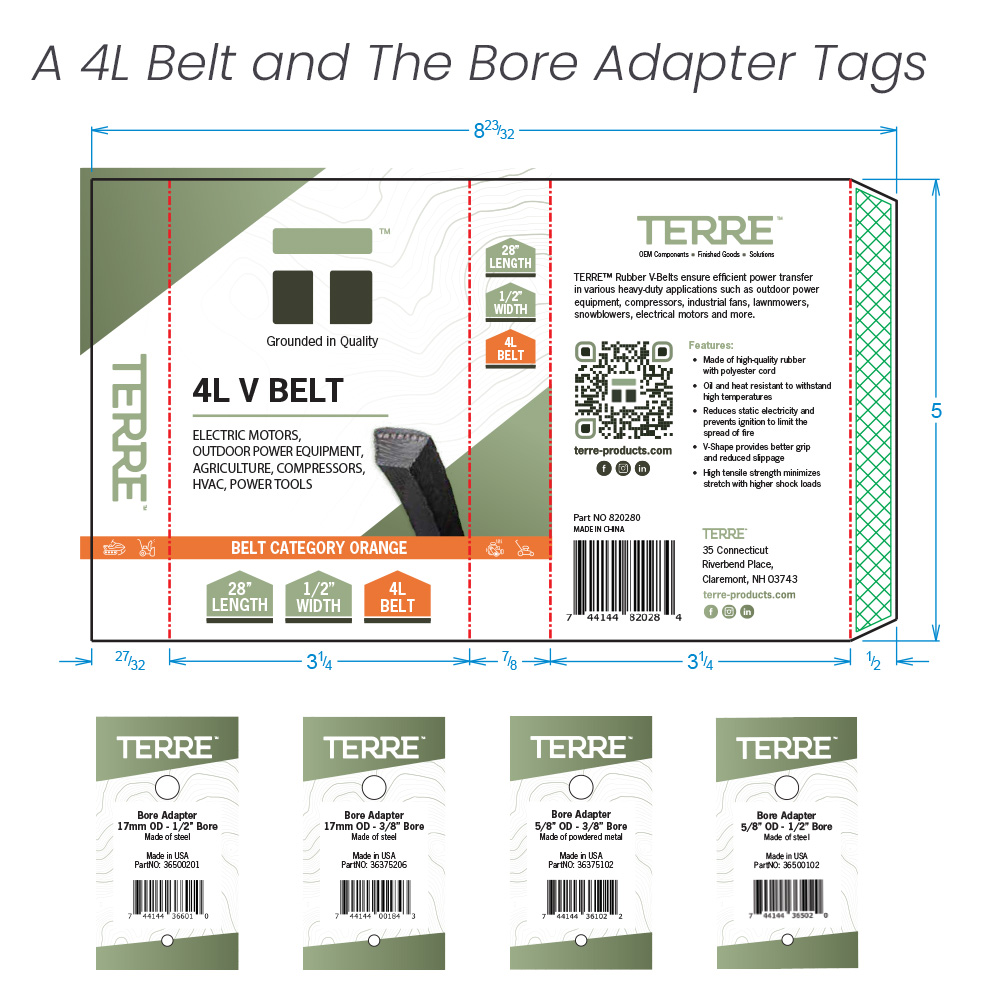
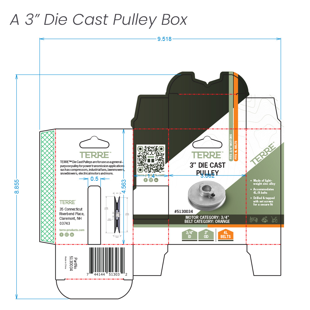
Tractor Supply also requested a color-coding system to help customers quickly match pulleys, belts, and motors. I created a visual system of color indicators that appeared across all packaging, simplifying both shelf stocking and the customer experience.
Final Designs and the Big Pitch
OUTCOME AND REFLECTION
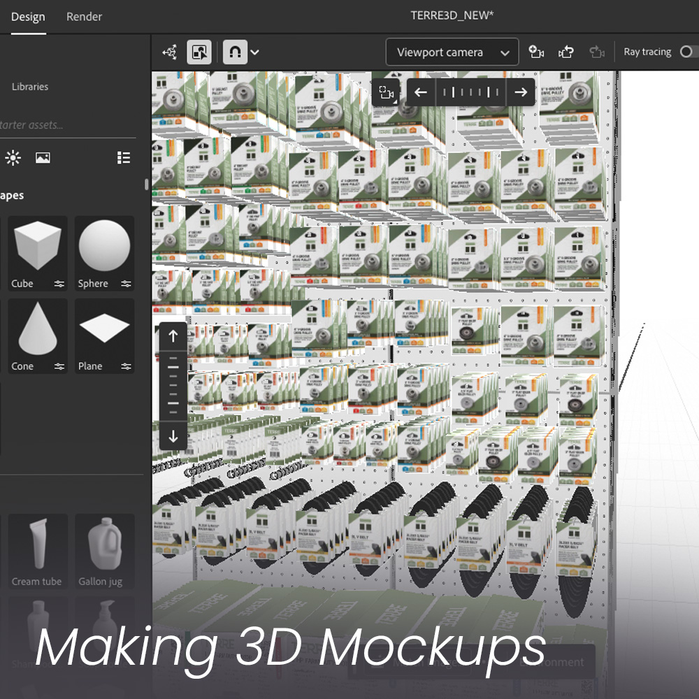
To support Terre’s pitch, I produced a series of high-quality 3D mockups that showed how the products would look on the shelf. These added the “wow” factor the client needed—and it worked. Tractor Supply responded positively, and the redesign made a strong impression.
In total, we wrapped the project with 88 SKUs, including:
Three types of pulleys in five sizes
Two belt packaging sizes
Bore adapter boxes
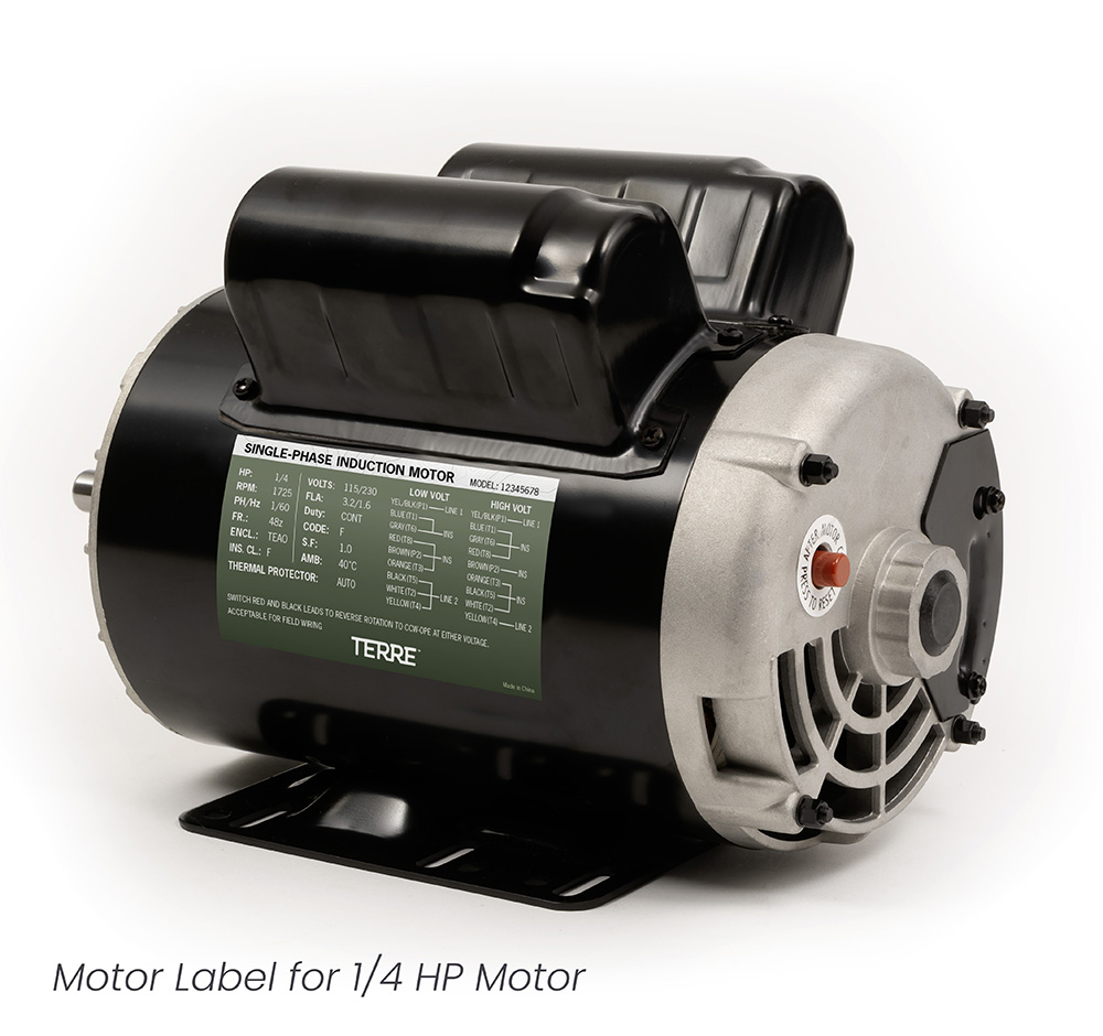
Motor packaging and labels
A matching chart and retail header signage
While the project faced delays and a rotating cast of client contacts, it was ultimately a success. If I tackled a similar project again, I’d implement a tighter project timeline in our management platform and be more proactive in guiding the client to hit key decision points.