Project Details
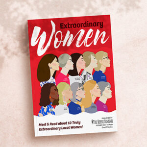
Extraordinary Women
The Extraordinary Women publication is a creative magazine the newspaper puts together yearly to showcase locals and drum up ad revenue and hometown support.
Project Type:
Magazine
Client:
The Keene Sentinel, Various Local Advertisers
Target Audience:
Women 50+ In the Local Monadnock Region
Programs Used
Indesign, Photoshop
Fun Fact:
This was the second year I was asked to be the lead designer for this publication.
“Do it like Last Year, But Even Better!”
PROJECT BRIEF
Off the back of 2020, I was asked to do the Extraordinary Women yearly publication again since I had done such a great job the year before. The Extraordinary Women Magazine is a local publication put out by the Keene Sentinel in the Monadnock Region in New Hampshire. It celebrities 10 local ladies who go above and beyond to be good people in their communities. The paper wanted another fun an creative take on this publication to continue to drum up support.
No time, No Pictures, No Help.
DESIGN CHALLENGES
Looking back on some projects, it’s easy to think, “That wasn’t so bad.” Unfortunately, this wasn’t one of those projects. The process of designing this magazine could best be described as a last-minute conundrum.
At the time, the publication had been facing significant challenges, particularly in the wake of the pandemic. A number of key team members had left, including the special publications editor, the full-time photographer, and one of the three graphic designers. Without a dedicated editor, this project was left on the backburner, and I didn’t receive finalized articles until just six days before the print deadline.
To complicate matters further, there were only one or two usable shots of each of the women, taken by a part-time photographer. As a result, the already overextended design team was down to just two people, leaving me with little support for the heavy design workload.
Despite these obstacles, the publication still needed to maintain a refined, feminine aesthetic—without relying on cliché or overused tropes like excessive pink tones. Balancing this delicate design challenge while managing all the other constraints made this project both uniquely difficult and ultimately rewarding.
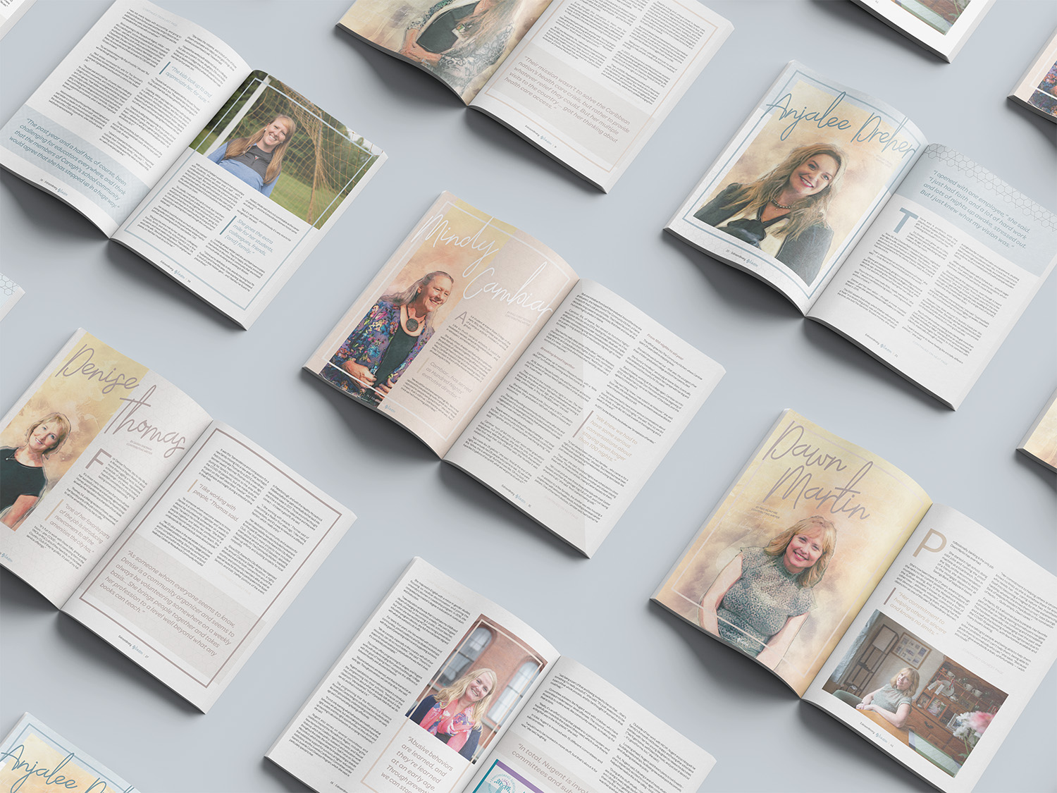
Art Filters to Stretch Limited Photography
CONCEPT AND SOLUTIONS
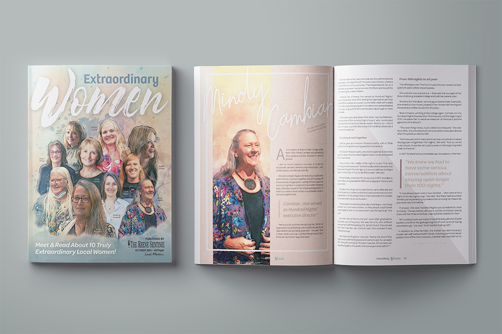
The watercolor art theme I developed for this publication was born out of necessity. At the time, the publication had only one part-time photographer, which meant we had just one or two images per article for each subject. With limited imagery available for each article, cover, and accompanying ads, I needed a solution to stretch these images across multiple pages without creating a repetitive visual experience.
I came up with the idea of using photo filters to create a watercolor effect for the hero images in each article as well as the cover. This approach allowed us to creatively extend the limited photography while adding a unique, artistic touch to the layout.
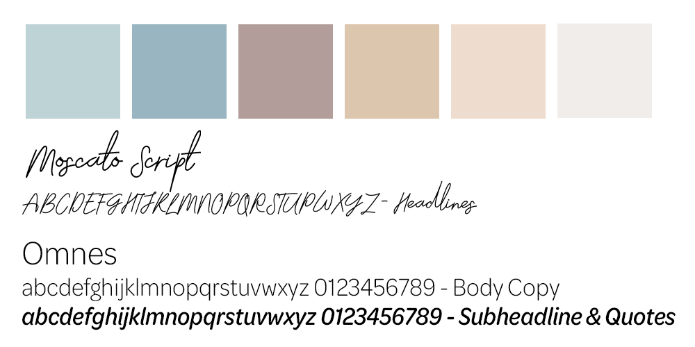
I carefully selected colors and fonts for the design to complement the watercolor theme. The tan was chosen to evoke the feel of elegant paper, while the teal added a vibrant pop of color. I paired a smooth script font for the headlines with a clean, easy-to-read sans serif for the body copy, creating a balance between the fluidity of the watercolor and the legibility of the text. To keep the design cohesive, I used boxes and lines to anchor the layout, adding color and structure without overpowering the artwork.
Well Received for Another Year
OUTCOME AND REFLECTION
Once again the community loved this magazine layout. It won second in the NENPA awards for Niche publication design and was talked about on the local radio show. I left the paper shortly after this publication, but a co-worker told me the following year had even more advertisers in it for this magazine.
For how little time and resources I had putting together this publication I still enjoy how it came out. I almost can’t believe how good it came out given how much of a train wreck the production was for it, but I made the best of a bad situation and still came out with a wonderful design and a story to tell. It’s not perfect, there are a few things I didn’t catch without an editor, like the footer font being from the year before, but I did also fix issues with the publications I ran into the year before so I still felt like this was a win in the end.