Project Details
Keene City Guide
The Keene City Guide is a local publication that serves as a directory for businesses, landmarks, and services in Keene, offering maps, general information, and exclusive coupons, primarily aimed at college students and visitors.
Project Type:
Magazine
Client:
The Keene Sentinel, Various Local Advertisers
Target Audience:
Students at Keene State College, and people looking to market to them.
Programs Used
Indesign, Photoshop
Fun Fact:
The Frozen yogurt coupon had been the same for 7 years of the City guide, but it was only until this issue that the students found it – good design means more eyes on the page!
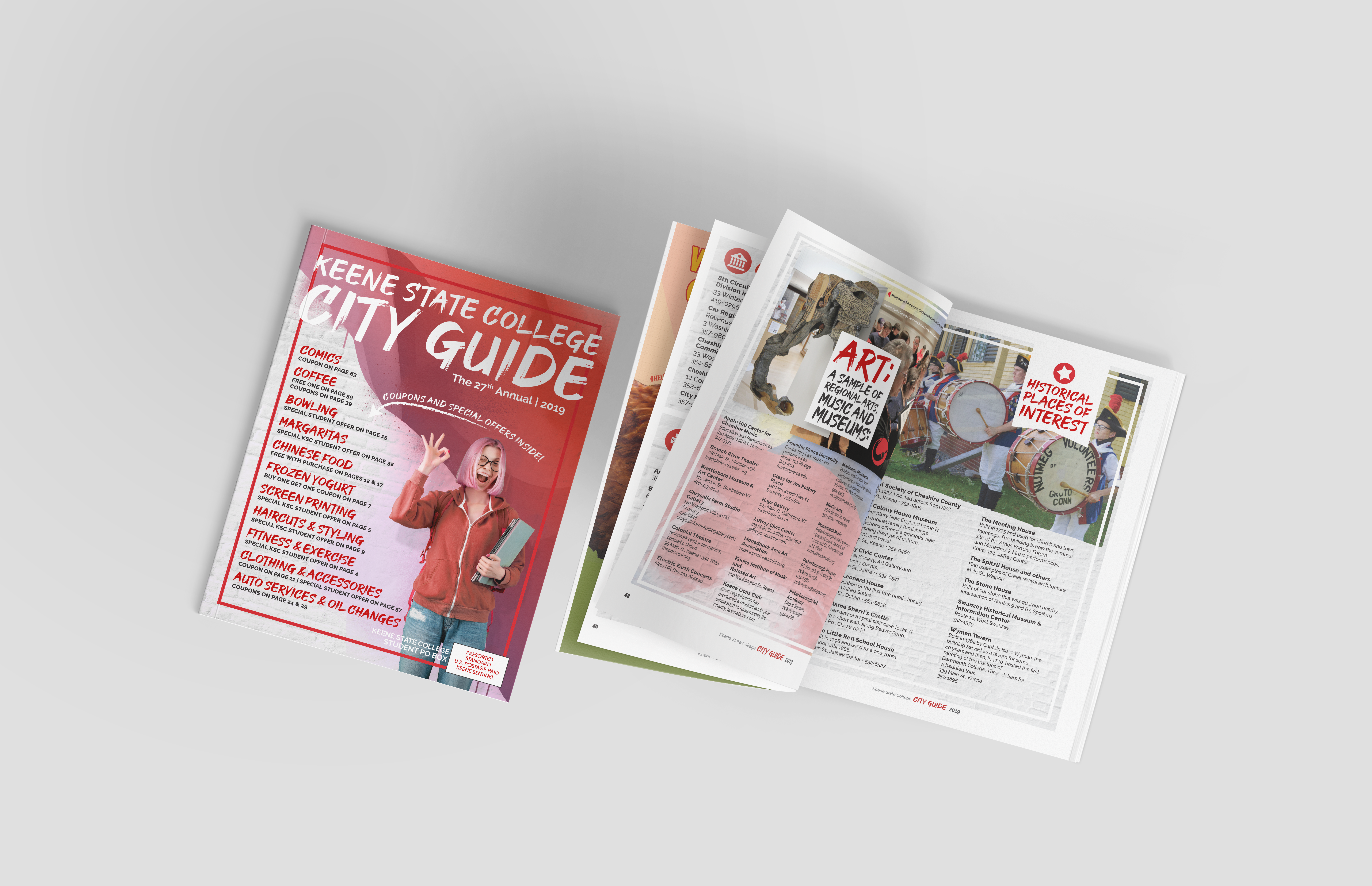
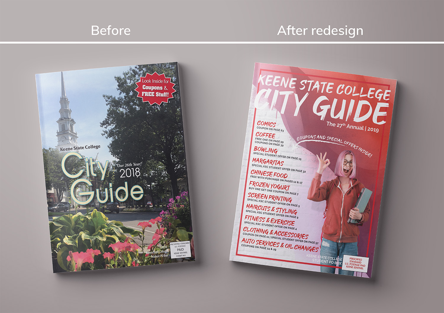
An Old City Guide in Need of a New Look
PROJECT BRIEF
During my time at the Keene Sentinel, I had the opportunity to redesign several local publications, but one of the most rewarding projects was the complete overhaul of the Keene City Guide. This small local publication primarily catered to college students but was also occasionally given to tourists. It included a directory of local businesses, landmarks, general information, maps, and coupons. While it may have seemed outdated in an age dominated by digital resources, it still held a place in the hearts of college students. In 2019, I was tasked with revitalizing this publication to make it more engaging and appealing to the younger audience it served.
Outdated and Lacking Direction
Design Challenges & Solutions
The City Guide had the feel of a publication stuck in time—almost as if it had been around since Keene State College’s founding in 1909. The design I inherited looked straight out of the 90s and carried the distinct impression of being an afterthought. It was a stark contrast to the vibrant, youthful energy of the local college community. I quickly realized that the publication’s design didn’t resonate with the target audience, and my challenge was clear: I needed to make it something college students would actually want to pick up, rather than toss aside.
To make matters more difficult, I was initially given minimal direction. When I asked for guidance, I was told, “The City Guide layout doesn’t have to be good, we just need to sell the ads in it.” That wasn’t enough for me—I wanted to create something visually appealing, not just a vehicle for advertising. So, I made sure to put time and care into every aspect of the publication, ensuring it was both functional and visually interesting, despite the nature of the content.
Adding Texture and Color to Pop
Design Solutions
Keene is a small city with a rich arts scene, full of vibrant murals and creative energy. Inspired by this, I decided to infuse the City Guide with a sense of that local street art culture. I chose a font reminiscent of graffiti, still readable but with an edge, and incorporated repeating brick and paint textures throughout the publication to evoke the feeling of the murals around town.
To connect directly with the student demographic, I utilized Keene State College’s signature red in the design, making the publication feel more like it was created specifically for the college community. The cover, which had previously been bland and uninspiring, became a colorful, eye-catching introduction to the content. I incorporated the art theme and added an image of a college student to make the cover more relatable. I also made sure to highlight the coupons and special offers prominently on the cover so that students would immediately recognize the value of the publication.
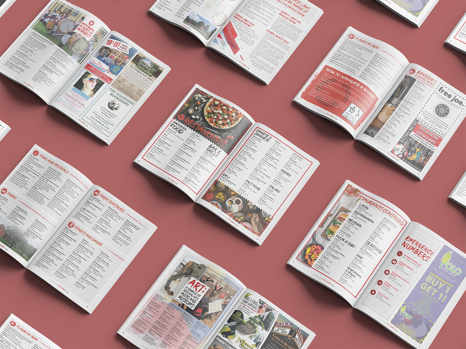
Inside, I focused on creating a clean, organized layout that was visually appealing and easy to navigate. I used large, bold images and added fun borders to create a more dynamic feel. I also redesigned many of the ads to make them more modern and engaging, pushing clients to update their visuals wherever possible. My goal was to breathe new life into the publication, giving it the modern, student-friendly vibe it desperately needed.
Success can be Measured in Frozen Yogurt Coupons
OUTCOME AND REFLECTION
The redesigned issue of the City Guide was a success beyond expectations. For the first time in years, the college reported running out of copies, and even more impressively, college students actually came into the newspaper office to request additional copies. While most of them were primarily interested in the buy-one-get-one-free frozen yogurt coupon (which quickly became a hit), the fact that students were engaging with the publication was a clear sign of success.
The frozen yogurt shop, which had been running the same ad for years with minimal results, saw a dramatic increase in coupon redemptions. So many coupons were clipped that they changed the terms of their future promotions. Although I still think they should have kept the generous offer running, it was clear that the redesigned City Guide was bringing the publication—and its advertisers—new life.
This was my first major design project post-college, and while I look back on it fondly, I can’t help but notice areas where I could have improved. For one, I didn’t realize at the time that we could print the magazine with a full bleed on the inside pages. As a result, the layout feels constrained by margins, which I now know could have been more dynamic with a full bleed. Additionally, I overlooked some fundamental design issues like orphans and widows (which I had learned about in design school) due to my fast-paced approach to the project. Some text and icons were also unnecessarily large, and overall, the design could have benefited from more fine-tuning.
Despite these flaws, the project was ultimately successful. It wasn’t just about creating a pretty publication—it was about making something that resonated with its audience and had a tangible impact. The City Guide went from being a forgotten piece of advertising clutter to a publication that college students were excited to engage with. While it wasn’t perfect, the experience taught me valuable lessons about balancing design principles with real-world constraints, and I’m proud of the outcome.