NLH LOVED this report so much that they sent me a swag bag and a hand written thank you note, along with 2 new hospital clients who wanted similar reports. 🙂
A New Take On A Yearly old Report
PROJECT BRIEF
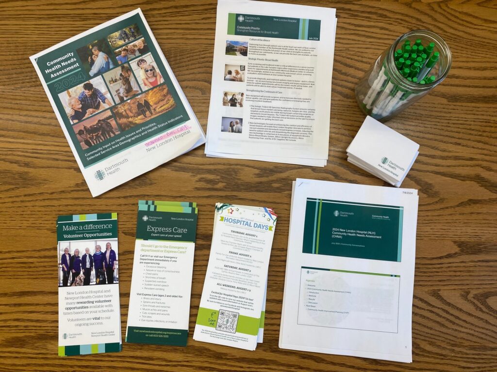
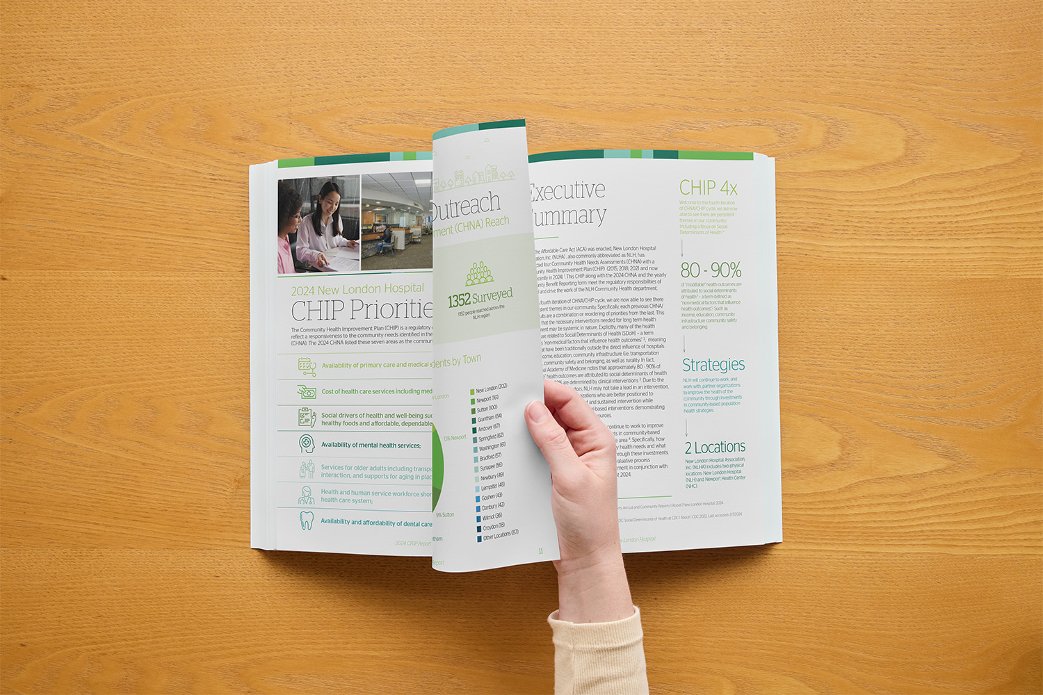
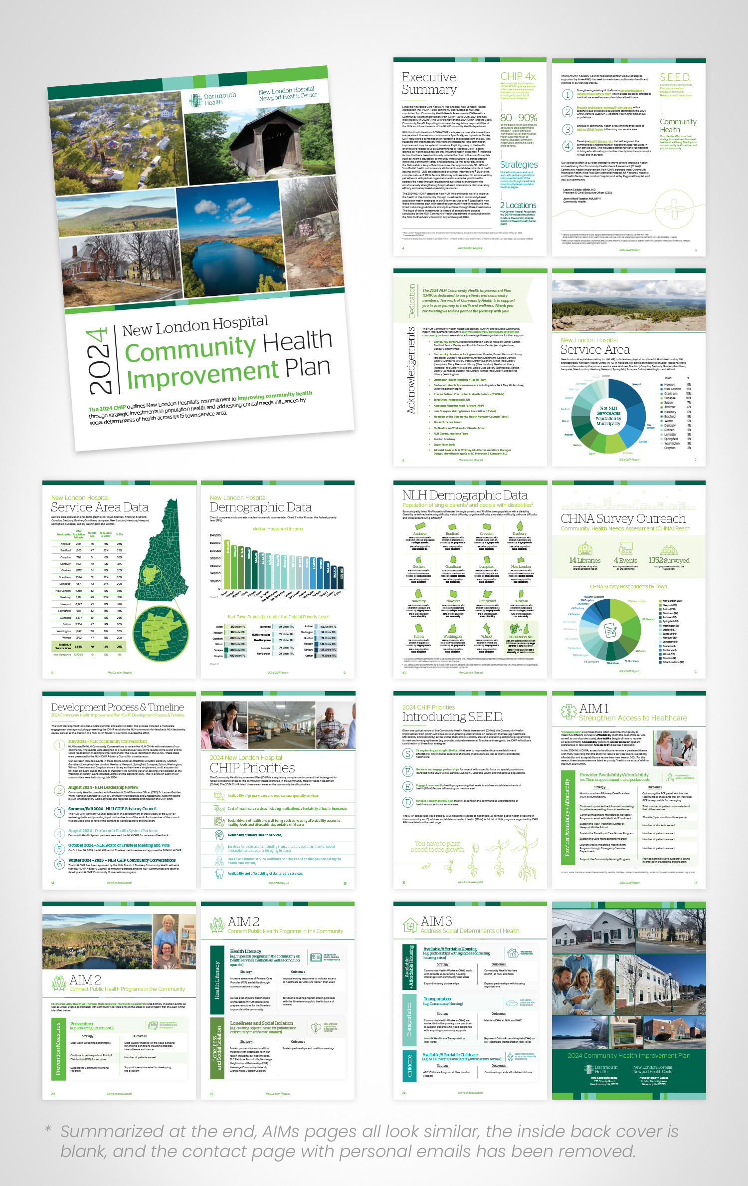
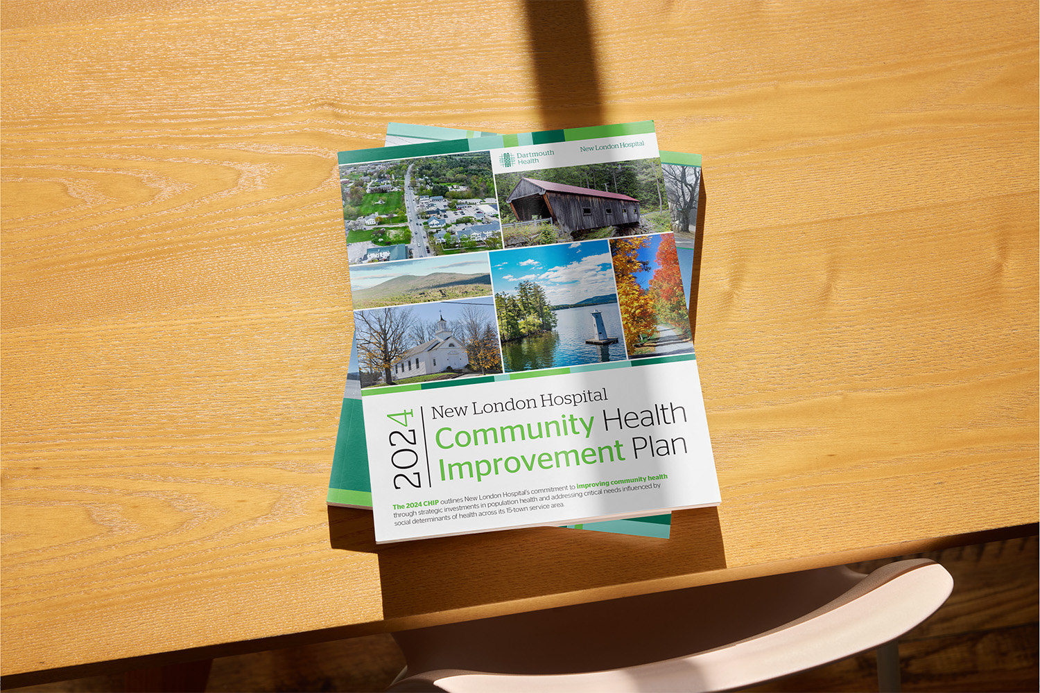
New London Hospital (NLH) in New Hampshire tasked me with designing the Community Health Improvement Plan (CHIP) report. This report is a required document for all hospitals, outlining key health improvement strategies within the community. While the content was essential, the design needed a transformation as many CHIP reports tend to be dense, difficult to read, and not visually engaging for the general public. My goal was to create a report that was not only visually appealing but also easy to understand and accessible for a broad audience, all while maintaining the hospital’s brand guidelines.
After working with Dartmouth branding for nearly 3 years and creating numerous branded items for New London Hospital, I knew exactly how to bring this report to life.
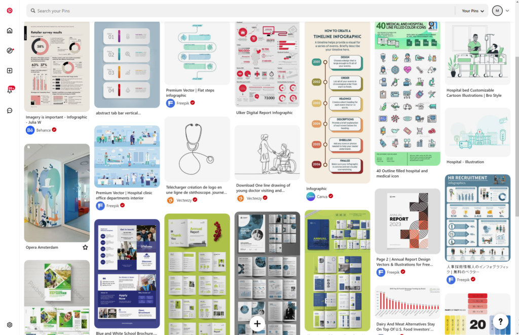
I don’t typically show every step of the process, but for this report, I created a full Pinterest board with my ideas alongside the examples NLH sent me of reports and graphics they liked.
Design From Scratch
Design Challenges
The main challenge I faced was making this report something that was easy to understand, even for people who don’t read well or have a hard time understanding charts. I wanted this to be clean and clear as possible. NLH Told me in the past their reports had gotten the feedback that they were too hard to understand, the hard numbers, and too much text turning away residents from reading the report that was made for them.
I was working from nothing but my past experience with the brand and some ideas collected by myself and NLH. I only had some starting with some text files that were even hard for me to understand. The hurdle was to make the information digestible. The report was very text-heavy, and much of the data was presented in a way that wasn’t visually compelling or easy to absorb. There was a need to condense and simplify the information, especially in sections that were overwhelming for readers, and to create a structure that allowed the public to grasp complex health data quickly.
Making Colorful Charts...
Design Solutions
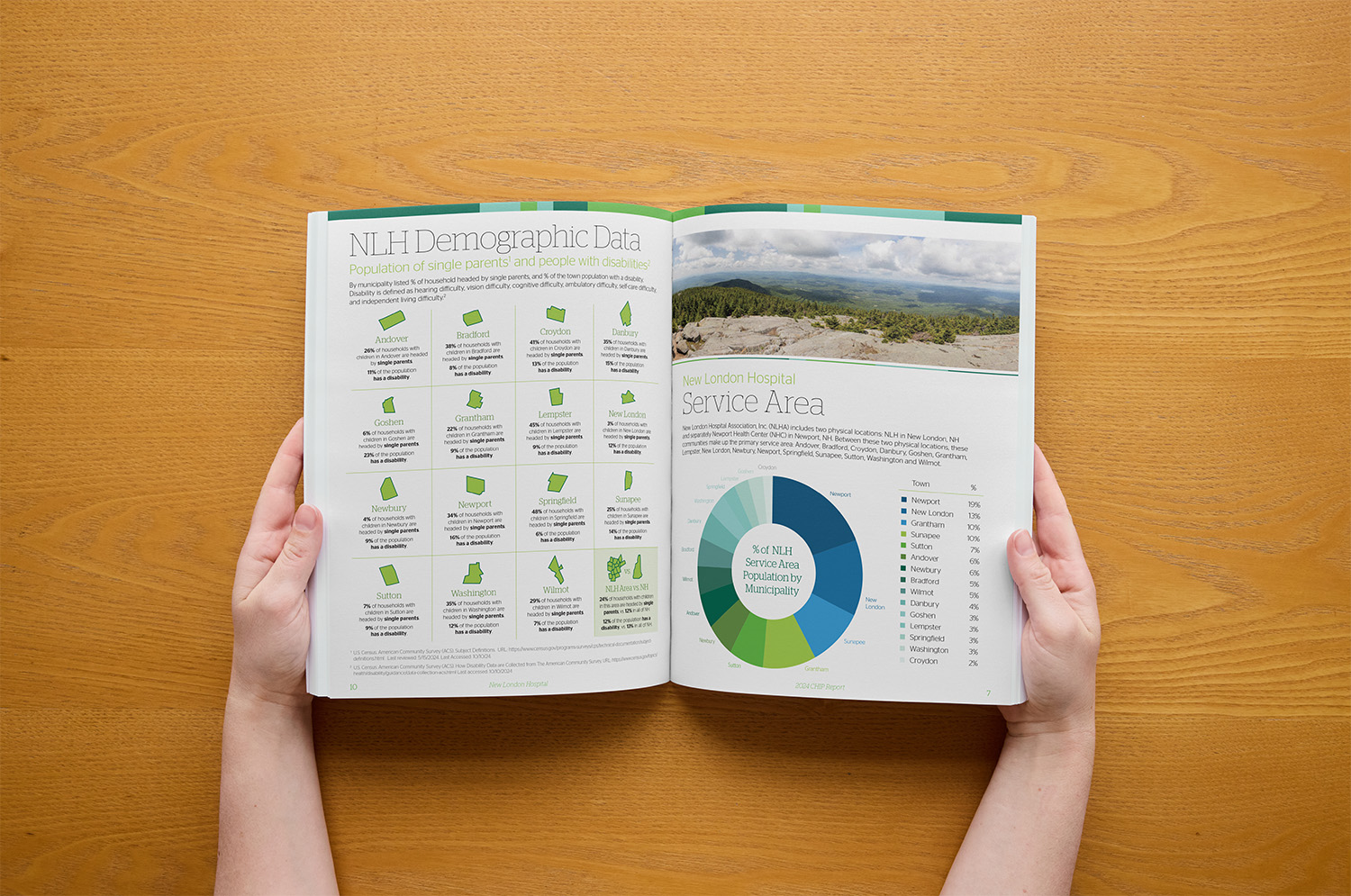
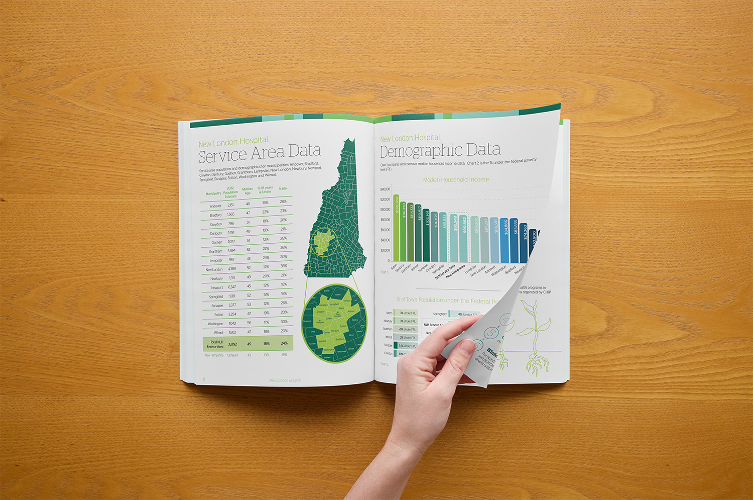
To tackle these challenges, I implemented a series of design solutions that made the report both informative and visually engaging. I took out key information and created a “Notes” column on the text-heavy pages to break up the content and make it more readable, and added headlines to every page so people could grasp what they were looking at quickly. Where possible, I transformed text-heavy data into easy-to-understand charts and visuals. One of my key achievements was designing a clear and visually compelling representation of the poverty percentage in each town, which had previously been a difficult-to-read block of data. The default way to make a chart of this data would be to make a bar graph, but as each number is a percentage out of 100 the bar chart looked like some towns had no poverty while others had three times as much! I sorted it out with a small progress bar for each town, giving a fair look at the poverty rate in each town in a fun and colorful way. Additionally, I expanded the color palette by incorporating tones from a photo of Kearsarge Mountain to create harmony with Dartmouth Hospital’s existing branding, which heavily featured green hues. Throughout the process, I ensured that the design adhered to the hospital’s branding and created a polished, professional final product.
A Great Report & More to Come!
OUTCOME AND REFLECTION
The outcome was a successful, visually striking CHIP report that stood out from other hospitals’ reports and garnered positive feedback. The client was so pleased with the design that she sent me a thoughtful thank-you card and a swag bag. She also shared that the report’s success prompted interest from other Dartmouth Health hospitals, with two additional hospitals requesting my services for their own CHIP reports. Reflecting on the project, I would have emphasized the importance of receiving final files before starting the design process, as having to redo charts multiple times due to file inconsistencies was time-consuming. I also realized that formatting the “Aims” section as a table, rather than using text boxes, would have streamlined the process and improved the overall layout. Nonetheless, the project was a great success, and I learned valuable lessons that would inform future work.