Project Details
Extraordinary Women
The Extraordinary Women publication is a creative magazine the newspaper puts together yearly to showcase locals and drum up ad revenue and hometown support.
Project Type:
Magazine
Client:
The Keene Sentinel, Various Local Advertisers
Target Audience:
Women 50+ In the Local Region
Programs Used
Indesign, Photoshop, Illustrator
Fun Fact:
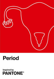
I based the color scheme on the PANTONE Color Period that PANTONE was promoting at the time.
A Difficult Year to be Extraordinary…
PROJECT BRIEF
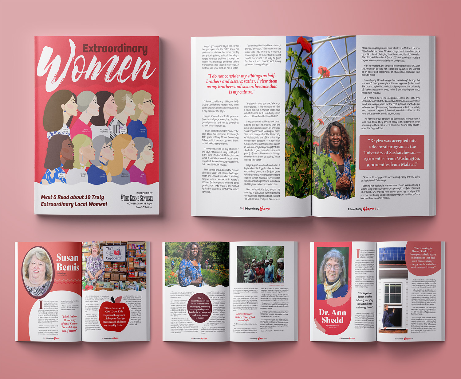
2020 will be remembered for many reasons, but for me, one of the standout moments was designing the Keene Sentinel’s Extraordinary Women publication. While working at the Small City Newspaper, I was tasked with revitalizing several of their long-standing local publications, many of which had not seen a major design update in years. This particular 2020 issue marked one of my first solo magazine layouts, showcasing 10 local women who had made significant contributions to the community and exemplified what it means to be extraordinary. My goal was to create a design that was as remarkable as the women featured within its pages.
Feminine But Not Pink.
DESIGN CHALLENGES
The Keene Sentinel placed a strong trust in their designers to shape their local publications, but there were specific guidelines for this issue. One key directive was to avoid the color pink, and more broadly, the design needed to reflect women’s empowerment without relying on clichés like flowers, glitz, glam, or other stereotypical imagery.
Additionally, this project came with the typical fast-paced newspaper deadline. From start to finish, I had just a week and a half to complete the magazine—while managing other design work—before it had to be sent to press. All of this was done remotely, on an outdated and slow laptop, adding another layer of challenge to the tight timeline.

Powerful Women Wear Red
CONCEPT AND SOLUTIONS
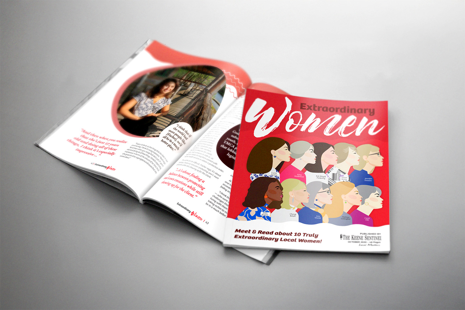
Bright red isn’t a color most designers typically gravitate toward—it’s bold and can easily overwhelm a design. But for a publication centered around powerful women, it was the perfect choice. I probably wouldn’t have considered it at first, but serendipitously, PANTONE had recently introduced a color for Women’s Month called Period, and I was immediately drawn to it. What better color to represent a magazine celebrating extraordinary women? After all, powerful women wear red for a reason.
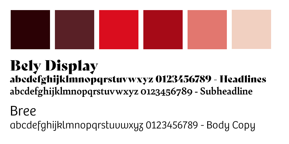
Inspired by this vibrant shade, I quickly developed a color palette and selected fonts that would complement it. Red, as a strong and commanding color, needed equally powerful typography. I chose Bely for the headlines—its bold curves conveyed strength—while Bree, with its clean, easy-to-read yet feminine design, was perfect for the body copy.
From the start, I wanted the layout to feel organic and fresh, avoiding rigid straight lines. This was a key design decision to break away from the sterile tone of 2020. To achieve this, I introduced a wavy pattern that repeated throughout the publication, adding movement and energy to the pages.
The cover—arguably the most important part of any magazine—needed to make a statement. In previous editions, the cover had featured a photo gallery of all the women featured inside, but this year, I wanted to elevate it with custom artwork. Using a base template for efficiency, I hand-drew the hair and features of each woman, creating a unique, on-trend cover that set the tone for the entire publication.
Well Received
OUTCOME AND REFLECTION
The Extraordinary Women issue was extremely well received within the community. The Keene Sentinel received numerous positive comments from the women featured, as well as attendees at the Extraordinary Women event. It also won 1st place for Niche Publication at the NENPA (New England Newspaper & Press Association) Better Newspaper Awards.
The following year, four new advertisers chose to place ads in the magazine, with one citing the 2020 issue as their inspiration. They mentioned it was “the best local publication” they had seen and wanted to support the cause by advertising. The Sentinel also received a generous donation from what we believe to be the mother of one of the women featured, accompanied by a note expressing appreciation for the publication’s quality.
This publication remains one of my favorite projects to date. It was both fun and challenging, and the final result was not only visually appealing but also deeply impactful, bringing joy to many during a difficult year. While I went on to design the publication again the following year, looking back now, I can’t help but feel that I’d approach it with a more critical eye today.
This was one of my first major projects after college, and in some ways, that’s evident in the details. For example, some text justification created awkward rivers, and there were instances of orphans and widows in the copy. I also didn’t have the confidence to challenge the editor when the “Note from the Editor” arrived three times longer than expected, resulting in 7-point font on the page. With the experience I have now, I know how I would have addressed those issues—and how a quick conversation with my boss could have solved them. Despite these small imperfections, I’m still proud of the color scheme, the theme, and the overall impact of the publication. It remains one of my standout projects.