Project Details
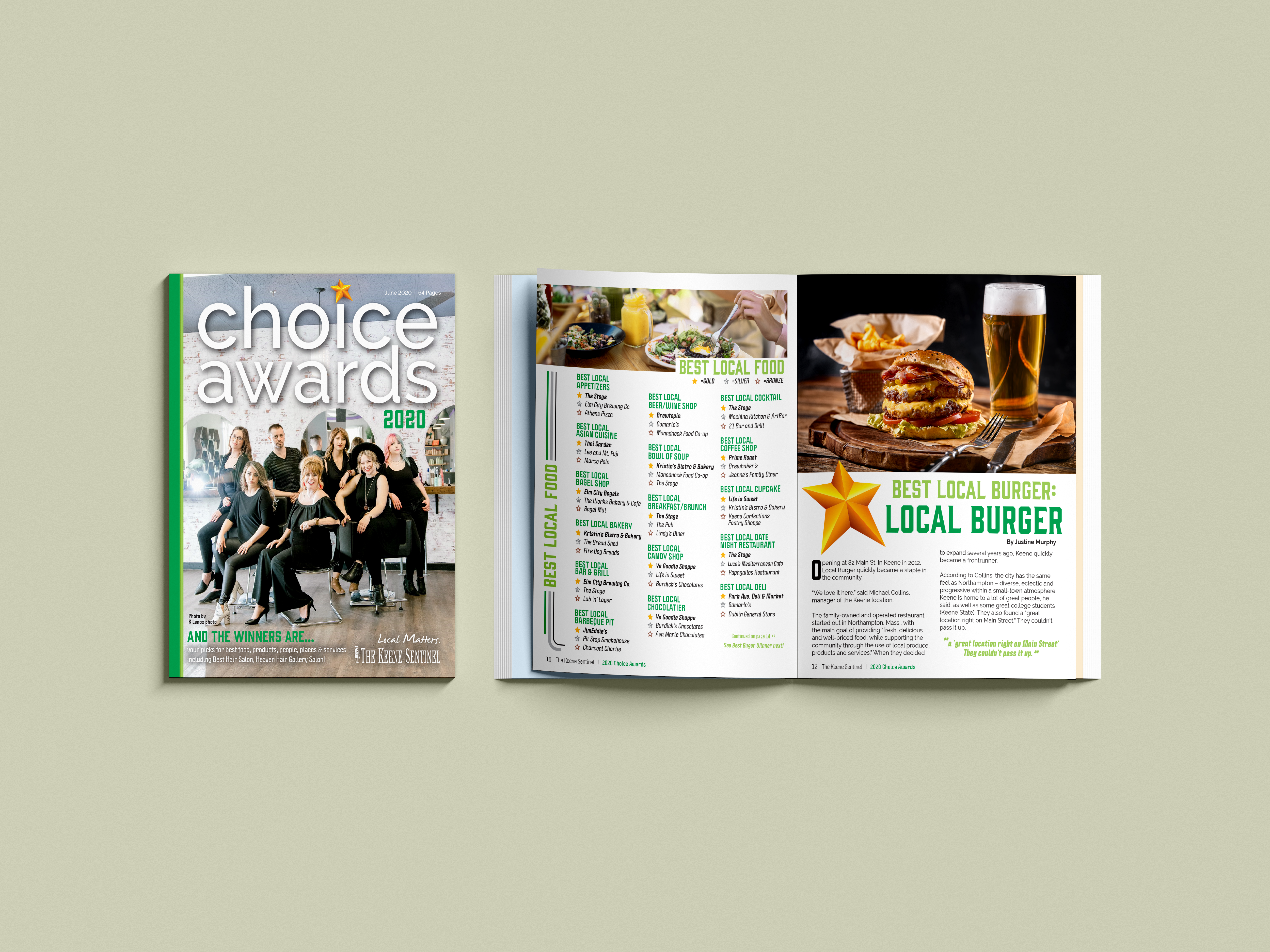
Keene Choice Awards
The Keene Sentinel hosts an annual Choice Awards, where local residents vote for their favorite businesses and services. This publication showcases the results, celebrating the best of the community.
Project Type:
Magazine
Client:
The Keene Sentinel, Various Local Advertisers
Target Audience:
Business Owners 50+ In the Local Keene Area
Programs Used
Indesign, Photoshop
Fun Fact:
The Sentinel had to remove the palm reader category from this publication because the two psychics got into a catfight over who won at the event- they didn’t see that one coming!
“Do it like Last Year, But Even Better!”
PROJECT BRIEF
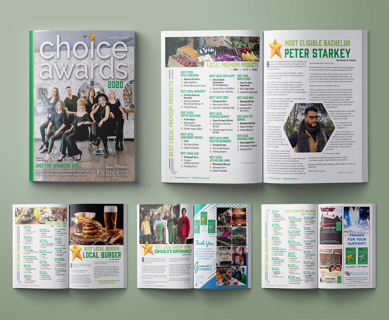
The Keene Choice Awards publication was one of the Keene Sentinel’s most profitable magazines, which made it all the more disappointing that it was also one of the least visually engaging. The publication was the result of the annual Choice Awards, where the newspaper would poll the community and have residents vote online for their favorite restaurants, stores, services, and even more niche categories like the best local DJ or car salesperson. Essentially, any category people cared about found its way into this publication, often resulting in a lengthy list of winners, interspersed with a few random articles to break up the content.
Boring Lists Cleaned Up
Design Challenges & Solutions
Creating a visually appealing list-based publication is a challenge, and at first, I wasn’t sure how to approach it. I wanted to move away from the bare, undecorated pages of previous editions, so I set out to find ways to fill the space and make the content more engaging. Since the color of the year was green, I developed an expanded color palette based around that shade and began with large, impactful headlines. Inspired by a design I had seen in another magazine, I incorporated lines along the sides of the pages. These lines helped enclose the content, transforming the long lists of winners into a cohesive design element, rather than disjointed items floating on the page. I also added images wherever possible to inject color and vitality into the layout.
For the typography, I selected bold, fun, and highly readable fonts to give the list items more weight and presence. The subheadlines in green, paired with star icons for the winners, provided a pop of color and added substance to the text-heavy pages.
Several of the ads were also given makeovers for this publication. I made sure to update every new ad and redesign I could find, aiming to give the entire publication—ads included—a fresh, cleaner look compared to the previous version.
More and More Advertisers
OUTCOME AND REFLECTION
The publication was well received by both the community and the other staff members, so much so that I was instructed not to change the layout for the next two years. During that time, the magazine grew from 64 pages to 80, with 16 additional pages dedicated to advertising. One local even loved their article so much that they framed it and displayed it in their shop.
However, I did encounter a challenge with a few blurry photos in this issue. I was often promised higher resolution versions, but they rarely materialized. It took me a few publications to learn the hard lesson: never slot a photo into the design if it’s too low resolution to look polished. If I were to work on this publication again, I would insist on receiving high-quality images upfront or find a way to resize them effectively within the layout without compromising the overall design.
Another lesson I learned from this issue was how to properly flow text so that there are no awkward rivers or runs. At the time, my coworkers thought it was fine and even found it funny that I didn’t know how to avoid these issues. The one colleague who could see my screen even remarked that teaching others wasn’t her job. While that moment was a bit humbling, it became an important learning experience. Since then, I’ve made it a priority to help my coworkers whenever I can, sharing knowledge and offering support so we can all improve our craft together.