Project Details
Monadnock Brides
The Monadnock Brides publication is a bridal magazine published yearly by the Keene Sentinel aimed at the local region.
Project Type:
Magazine
Client:
The Keene Sentinel, Various Local Advertisers
Target Audience:
Women 20-35 In the Local Monadnock Region
Programs Used
Indesign, Photoshop
Fun Fact:
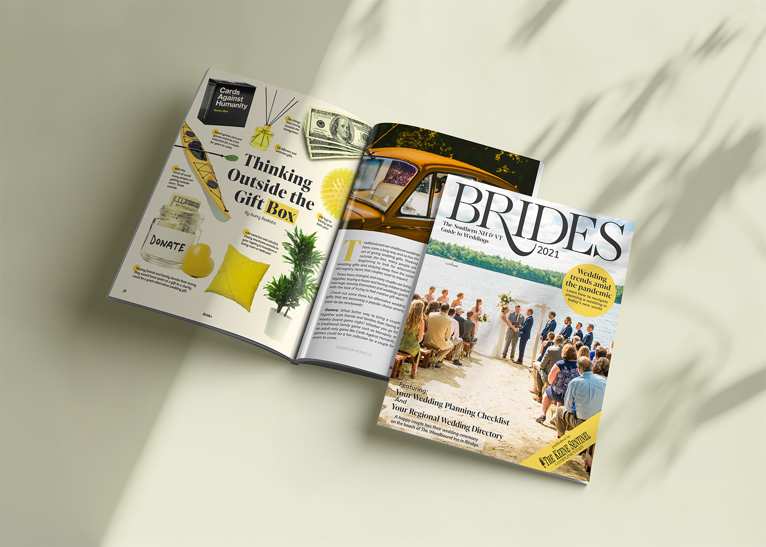
The cover counted as an ad space and the Inn that purchased it changed the cover photo 13 times during this project!
A Wedding Magazine for the Year of No Weddings
PROJECT BRIEF
During my time at the Keene Sentinel, I had the opportunity to design for several local magazines, including Monadnock Brides, a regional bridal publication. The 2021 edition presented a unique challenge—how do you create a wedding magazine in the middle of a global pandemic?
While 2021 was a year with far fewer weddings than usual, the Sentinel still chose to publish the magazine, and I was tasked with designing it. I had previously worked on the 2020 edition, which had been produced in late 2019, before the pandemic reshaped the world. But for the 2021 issue, I knew I had to create something that felt professional, uplifting, and hopeful, while acknowledging the difficult circumstances of the year.
Designing a Wedding Magazine in a Pandemic
DESIGN CHALLENGES
Working remotely added another layer of complexity. Communication became more challenging, with email and phone calls replacing in-person discussions. Coordinating articles, images, and tight deadlines was made more difficult by the need to keep track of multiple moving parts. Still, I took it as an opportunity to improve my remote collaboration skills and adapt to the constraints.
The design needed to reflect a sense of warmth and optimism, as the world was grappling with the uncertainty and stress of the pandemic. My editor suggested using lighter colors compared to the previous year’s navy blue, and my colleagues wanted plenty of beautiful images to help readers temporarily forget the challenges of COVID-19.
Choosing the Right Design Elements To Make Covid Vanish
CONCEPT AND SOLUTIONS
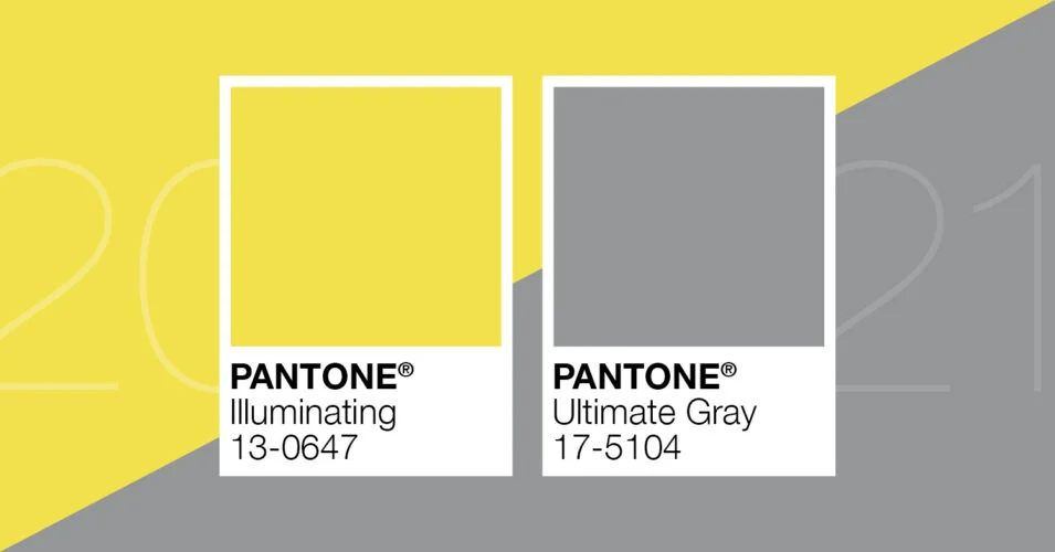
Pantone’s colors of the year were a warm grey and a bright yellow—colors that instantly felt perfect for this publication. These hues brought a sense of warmth and sunshine that could counterbalance the difficult reality of the previous year. To complement the colors, I selected modern fonts, incorporating a thick serif typeface for a luxurious feel and a clean sans-serif font for body copy, ensuring readability and elegance throughout.
For the layout, I focused on keeping things light and airy. I experimented with creative ways to showcase images and elements without using rigid lines. By incorporating subtle patterns, drop shadows, and floating items, I avoided a cluttered or enclosed feel, which helped create a more open and spacious atmosphere. Full-bleed images and elements extending beyond the page helped reinforce this effect.
I worked with a library of local photographers’ images, carefully selecting those that matched the warm and optimistic tone we were striving for. With input from my editor, we coordinated with photographers ahead of time, which gave me a rich selection of images to work with. In some cases, I enhanced the photos by applying filters to ensure they harmonized with the overall color scheme.
Additionally, I handled most of the advertisements in the magazine. While many of the ads were carryovers from the previous year, I ensured that new advertisements were bright, fresh, and aligned with the positive, airy theme of the publication.

A Beautiful, Uplifting Bridal Magazine
OUTCOME AND REFLECTION
The feedback on the final product was overwhelmingly positive. Advertisers shared their appreciation for the design, and we received heartfelt thank-yous from the photographers we featured. While we missed the opportunity for direct feedback from the local bridal trade show (which was canceled in 2021), the magazine’s success was clear—Monadnock Brides retained its advertisers the following year, a significant achievement during such a challenging time.
Reflecting on the project, I was very pleased with how the layout turned out. The use of bright colors and open design made it feel fresh and uplifting, and I felt the publication successfully captured a sense of hope in an otherwise difficult year. If I had more time, I would have revisited the ads to ensure all were updated and met the necessary print quality standards, as some of the older ads were lower resolution. However, given the tight timeline, I made the best of the situation, and overall, I was proud of the finished product.
I was already informed that I’d be designing the next edition, which made me even more eager to improve upon this design, particularly by addressing the ad quality and ensuring every aspect of the magazine was as polished as possible.