Project Details
Monadnock Brides
The Monadnock Brides publication is a bridal magazine published yearly by the Keene Sentinel aimed at the local region.
Project Type:
Magazine
Client:
The Keene Sentinel, Various Local Advertisers
Target Audience:
Women 20-35 In the Local Monadnock Region
Programs Used
Indesign, Photoshop
Fun Fact:
No other advertisers wanted to be near the Adam and Eve lingerie ad, so I had to find a way to place it on a spread with no other ads!
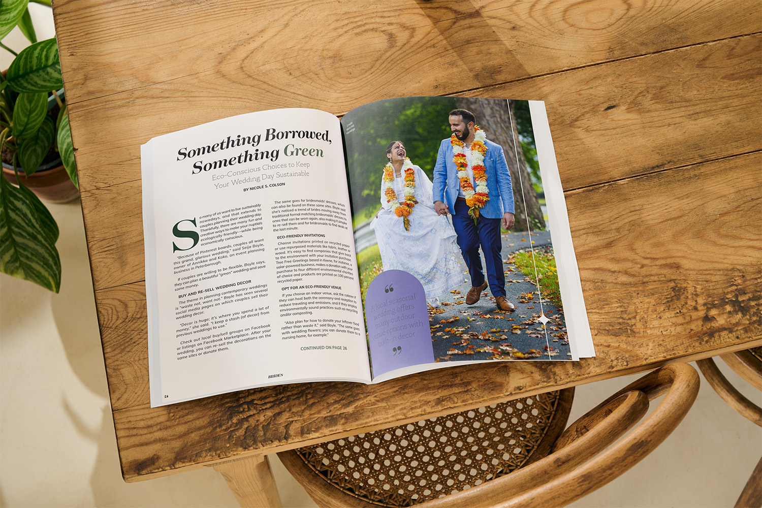
A Fresh Take on Bridal Design
PROJECT BRIEF
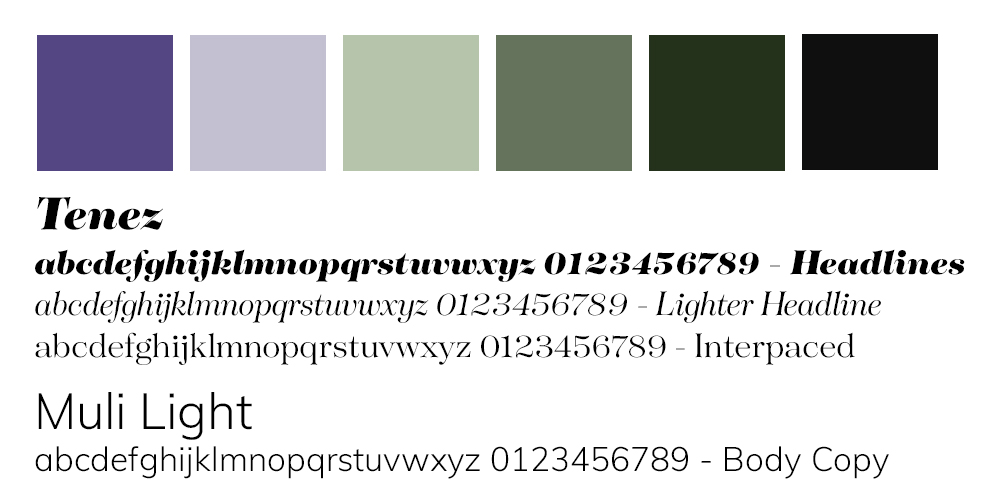
For the 2022 edition of Monadnock Brides, I was tasked with reimagining the magazine’s design to better appeal to a younger, more diverse audience. The key goal was to create a modern, vibrant look that felt fresh and trendy, while still maintaining the elegance that brides expect from a wedding magazine. We were working with Pantone’s Color of the Year—a bold purple—along with a complementary palette of violet and green to infuse the magazine with energy and warmth.
The magazine was to reflect a more contemporary approach to weddings, featuring modern typography, on-trend design elements, and a greater diversity in the imagery. A focus on engaging new advertisers was also central to the design direction, as was preparing for a debut at the local bridal event.
A Tightrope Between Bold and Traditional
DESIGN CHALLENGES
With the aim of attracting a younger crowd, I faced the challenge of balancing bold, contemporary design choices with the expectations of Monadnock Brides‘ established readership, many of whom skew older. The challenge was clear: how could I create a trendy, youthful feel without alienating the loyal, older demographic?
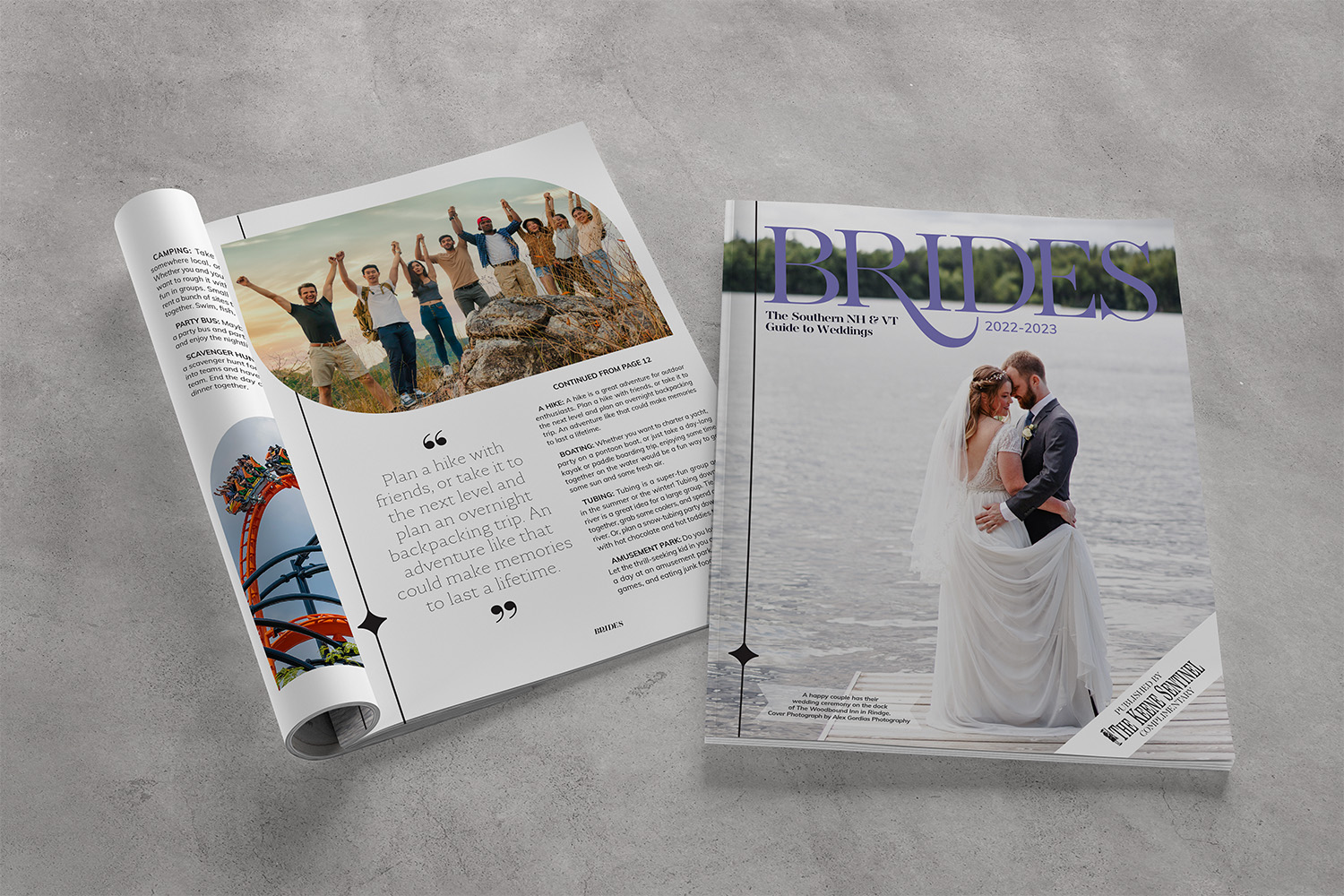
The Keene Sentinel traditionally prefers larger body copy for ease of reading, but to align with current design trends, I was granted permission to make the body text slightly smaller, aiming for a more streamlined, sophisticated look. Additionally, while the publication had always showcased more traditional images of weddings, I needed to push the envelope by using diverse and inclusive photos, reflecting the modern couples in the area.
Finally, the need for fresh, high-quality imagery was a constant concern. Despite efforts to secure all photos in high resolution, I encountered a few delays that resulted in some blurry images making it to print, which I would have to address moving forward.
Modern, Vibrant, and Diverse
CONCEPT AND SOLUTIONS
To capture the spirit of 2022, I drew on Pantone’s Color of the Year (a striking purple) and extended the palette with rich violet and green tones, creating a dynamic and youthful color scheme. I also incorporated trendy design elements—organic shapes, asymmetrical layouts, and clean, minimalist typography—aimed at appealing to a younger, style-conscious audience. This design language helped create a modern aesthetic while keeping the overall feel fresh and inviting.
I paired modern, thin sans-serifs with a bold serif for the headers, creating a chic but readable typography combination. These fonts allowed for flexibility in page layouts, contributing to a stylish yet approachable vibe.
I also made an effort to incorporate more diverse imagery, featuring a range of couples and wedding styles to reflect the inclusive nature of today’s wedding culture. The images were carefully curated to align with the overall mood of the publication, offering an authentic, relatable representation of modern weddings.
To address the challenge of blurred images, I made sure to clean up ads wherever possible, ensuring they met a high-quality standard. I was proactive in reaching out to photographers for better images where needed, though I learned a valuable lesson about never placing a low-res image unless absolutely necessary.

Success and Lessons Learned
OUTCOME AND REFLECTION
The 2022 Monadnock Brides edition was well-received, both by the younger demographic and advertisers. We saw a significant influx of five new advertisers, drawn in by the magazine’s modern, vibrant design. At the local bridal event, which was smaller than usual due to ongoing COVID-19 restrictions, all copies of the magazine were eagerly taken by attendees. It was a stroever, while the design was a hit with younger readers, we did receive feedback that the older demographic wasn’t as keen on the trendier, more minimalist approach. Despite this, the overall response from new advertisers and the positive reception at the bridal event showed that we were on the right track with the new direction.
Looking back, I’m proud of the design, but I also recognize areas for improvement. The blurry photos were a hiccup I could have avoided by ensuring all images were received in high resolution, I was promised I’d get better phots and never did. Lesson learned to never place low-quality photos on the promise of higher ones, I needed to say he needed to provide higher rez photos or not be included. It’s a valuable lesson learned for future projects: always wait for the full-quality files, or find suitable alternatives in the meantime.
Overall, the 2022 issue of Monadnock Brides was a success, and I’m excited to continue pushing the boundaries of bridal design while refining the process for even greater results in the future.