Project Details
Renewal compost
Renewal Compost is a local composting service catering to homeowners and businesses in areas with composting ordinances. They pick up the food scraps and turn them into compost.
Project Type:
Misc Print Collateral
Client:
Renewal Compost
Target Audience:
Wealthier residents and restaurants in towns and cities that require composting.
Programs Used
Indesign, Photoshop, Illustrator
Fun Fact:
Renewal liked the first flyer design so much they returned for more design work!
For A Local Composting Company
PROJECT BRIEF
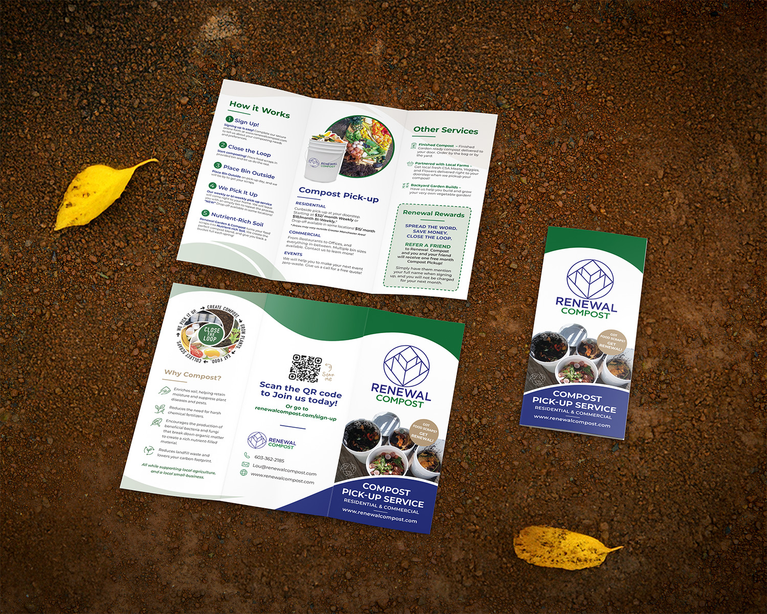
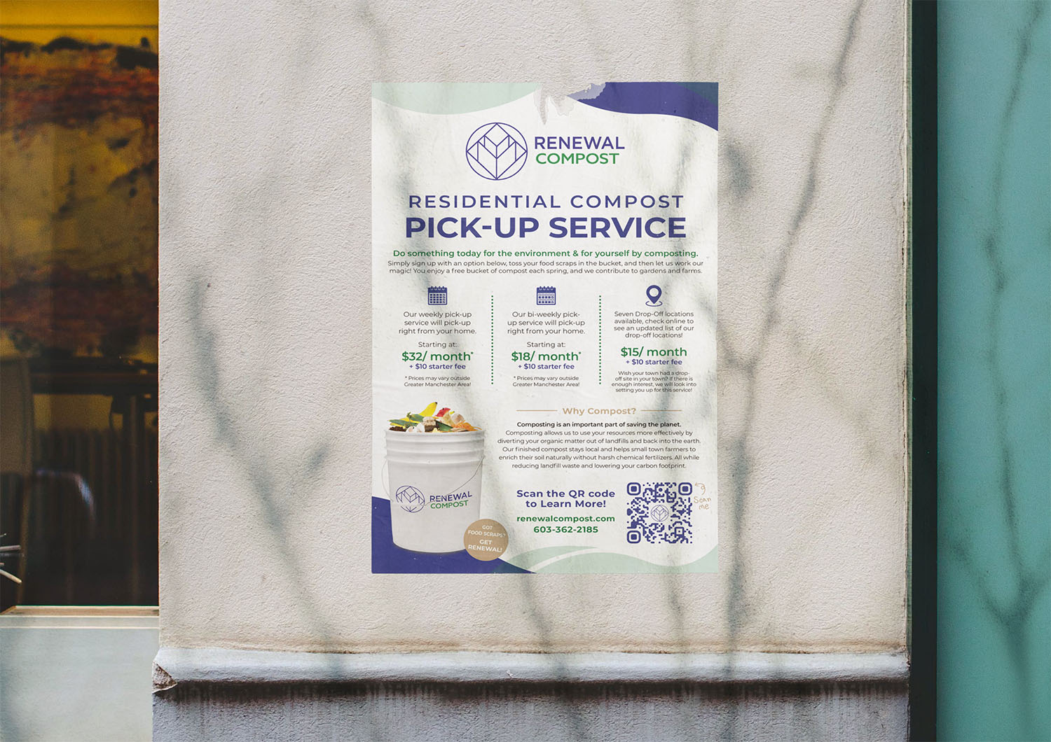
Renewal Compost is a local composting service catering to homeowners and businesses, including restaurants, in areas with composting ordinances. They provide containers for food scraps and swap them out regularly, transporting full containers to their composting facility. The company sought a design refresh for their marketing materials, including a brochure, poster, handout sheet, and postcard. They wanted a modern update that better reflected their eco-friendly values, as they were unhappy with their previous designs.
Straight Lines Are Not Eco-Friendly
Design Challenges
The main challenge was working with the outdated and overly rigid design elements of their previous materials, which featured heavy color blocks and outdated typography (such as Times New Roman). The designs lacked the natural, organic feel that aligned with their business model and mission. Additionally, the client’s desire for a more modern and clean aesthetic required a shift in both structure and color scheme, all while retaining their brand’s essence. The brochure I was handed looked like it was for a hardware store, with how many hard lines and bright colors it had, but nothing like the smooth lines they didn’t know they wanted.
I also had to design the poster from scratch, presenting the information in a way that made sense. The word doc I started with was jumbled and hard for customers to understand. I knew I needed to correct this.
Smooth and Zen is the Way to Go
Design Solutions
To address these challenges, I focused on creating a softer, more organic design by replacing harsh, blocky elements with smooth, flowing curves. These curves were intended to evoke the natural processes of composting and sustainability. For the color palette, I used lighter shades of their existing brand colors—blue, green, and brown—to create an airy, modern feel, while reserving the deeper tones for headlines and callouts to maintain a sense of brand recognition. This approach resulted in a design that felt fresh and eco-conscious while still maintaining a connection to their established identity.
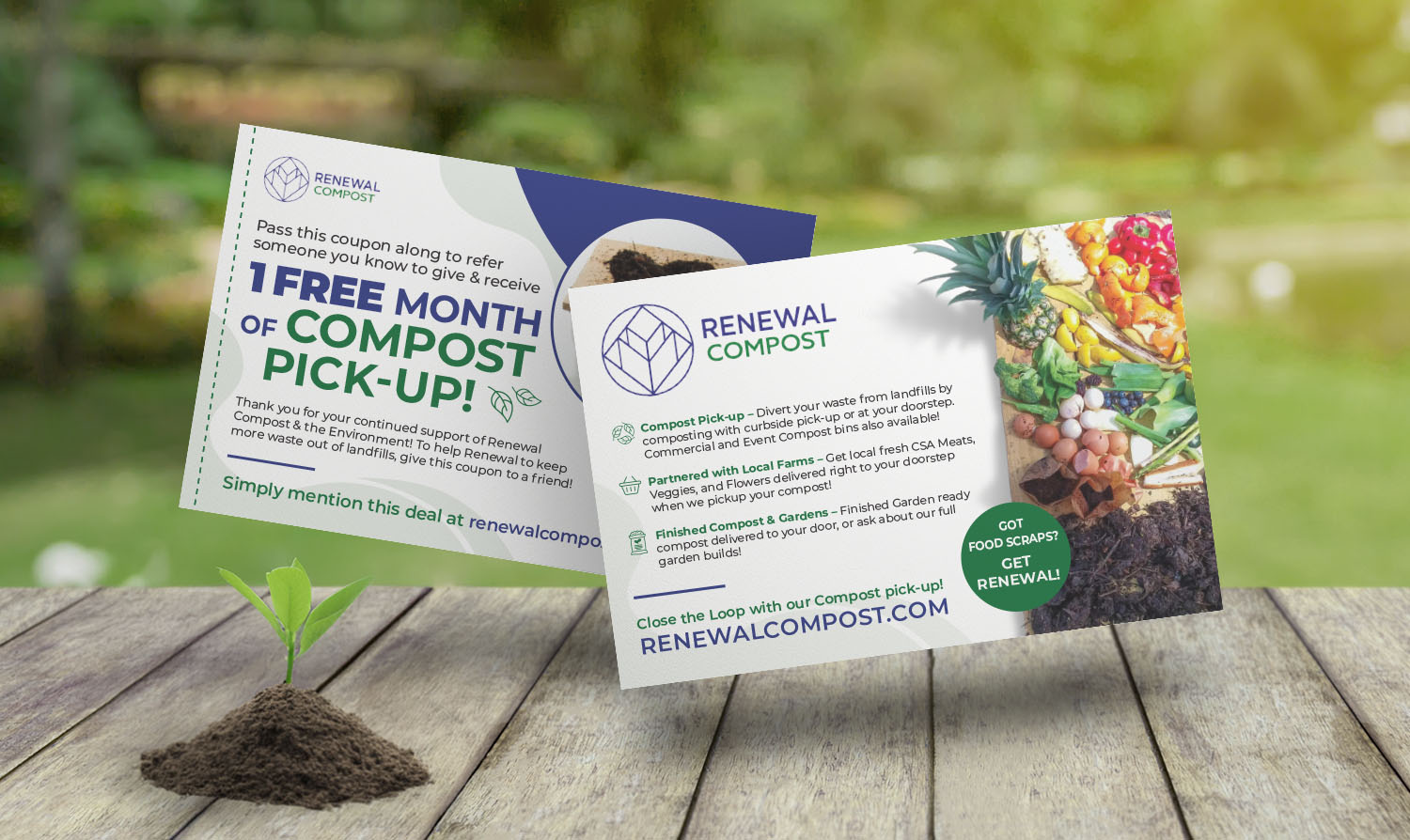
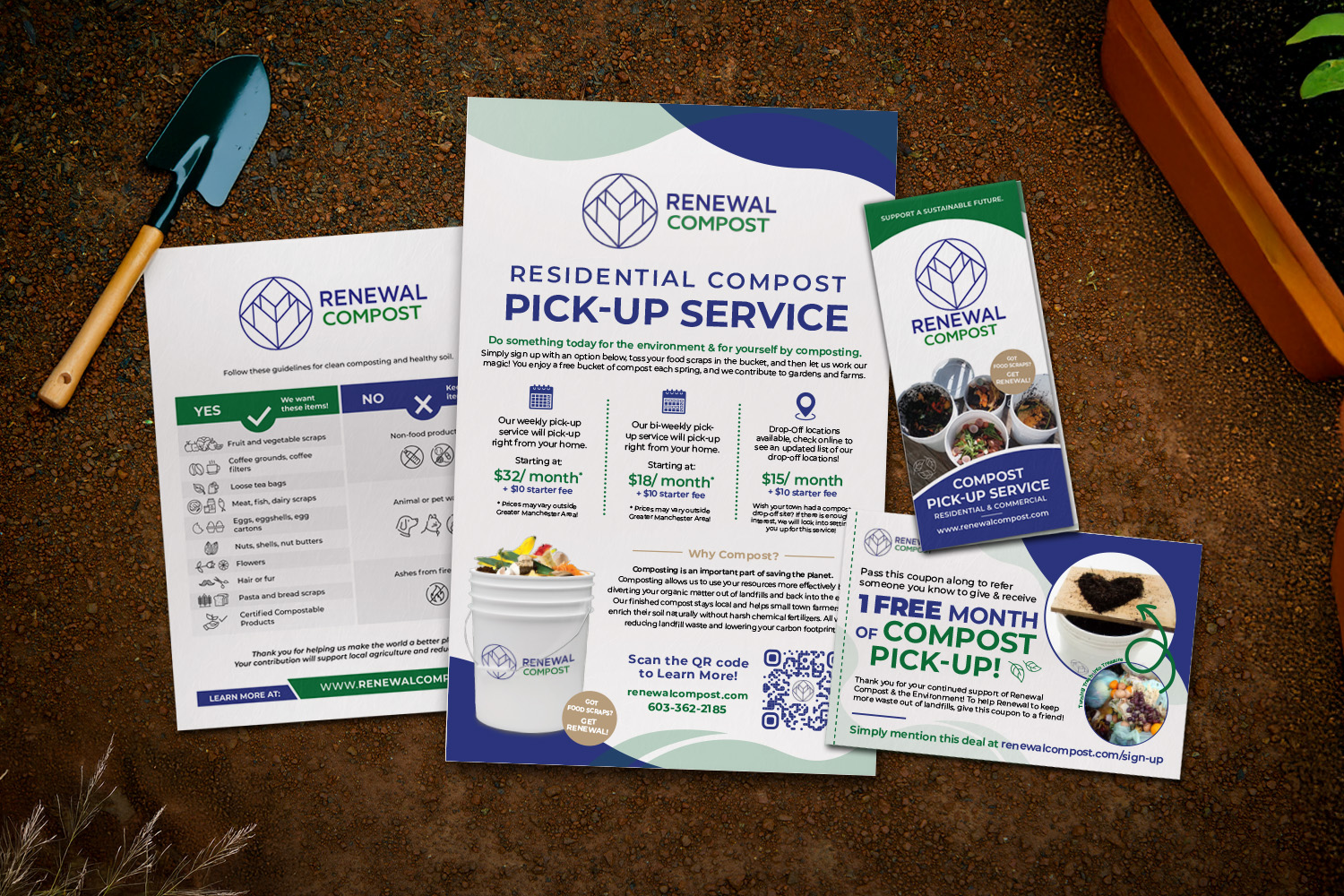
My first flyer for Renewal Compost was a flyer on what to add to their compost vs not. Simply put their customers hadn’t understood the written instructions they had been given previously, so I made a point to graphically represent the items you can and cannot compost.
I also spent time to organzine the information on the post and brochure to be clear and easy to grasp. While the poster was a ground up project, Renewal Compost did have a previous brochure. It had been boxy and hard to follow with how many items they tried to fit. I made sure to make it match the poster with easy-to-follow sections and only the necessary text.
More Composting Fun
OUTCOME AND REFLECTION
The updated designs were a hit with Renewal Compost, and after the first handout was delivered, they requested additional work, including new posters, brochures, and postcards. The referral postcards were particularly successful, contributing to a 20% increase in their referral program. This led to a continued partnership, with Renewal Compost becoming a loyal client. Looking back, I’m proud of how the project turned out—simple, smooth, and aligned with the company’s values.
The only thing I would do differently is to remove the hidden layer I had forgotten about before printing. Because I had a white box on a hidden layer, it got printed and the first batch of posters had to be scrapped. Funnily enough, the final print proof to the client had had the white box showing, but you can’t always trust the client to catch your mistakes. After that I added a checkbox to my prepress checklist to remove any hidden layers before sending anything to press.