Project Details
Willow Brook Builders
Willow Brook Builders LLC is a renovation company based out of New Hampshire that specializes in High end kitchens and baths.
Project Type:
Logo and Branding
Client:
Willow Brook Builders LLC
Target Audience:
Primarily, women aged 35-65 from households making $120k+ yearly.
Programs Used
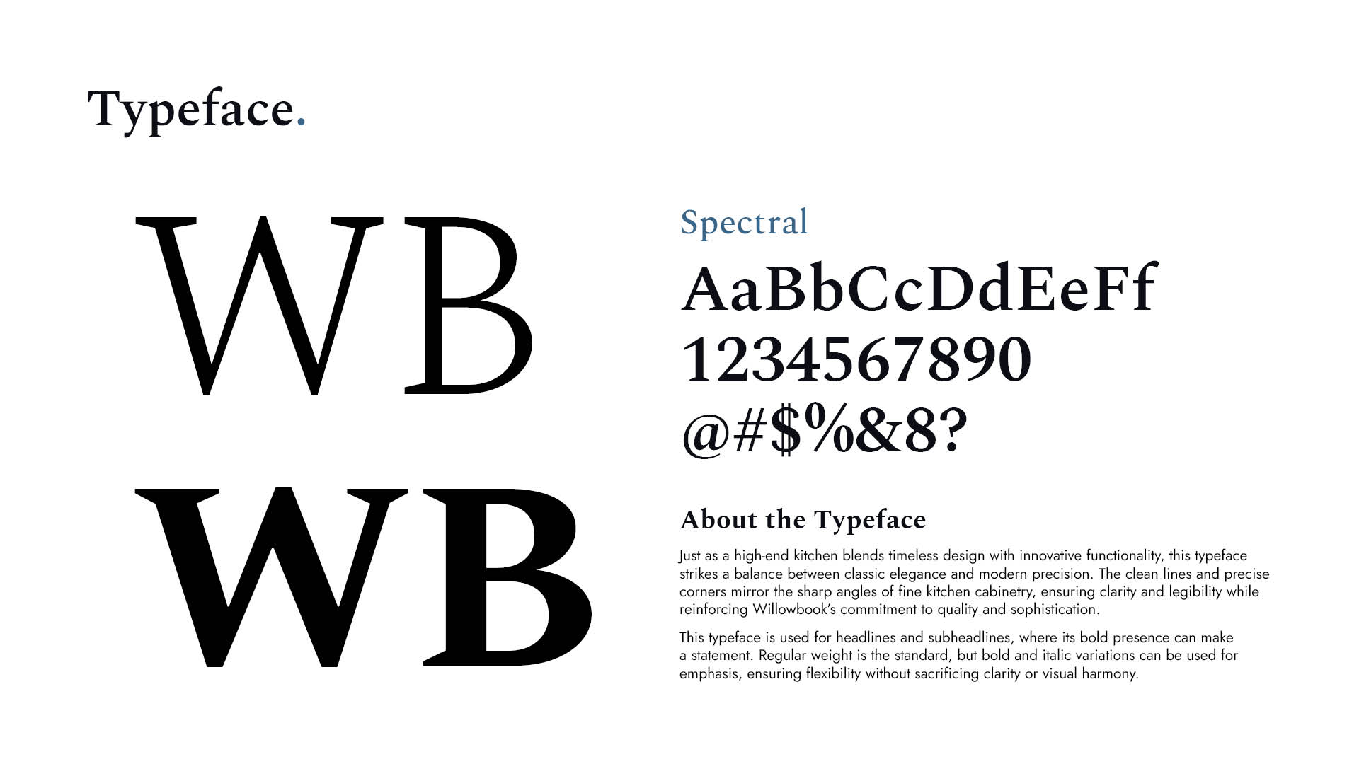
Illustrator, Indesign, Photoshop, Power Point (Final Guide Requested in PP)
Fun Fact:
The owner wanted his logo to be based on his vintage car grill, but after many drafts agreed it was not a good fit for his company.
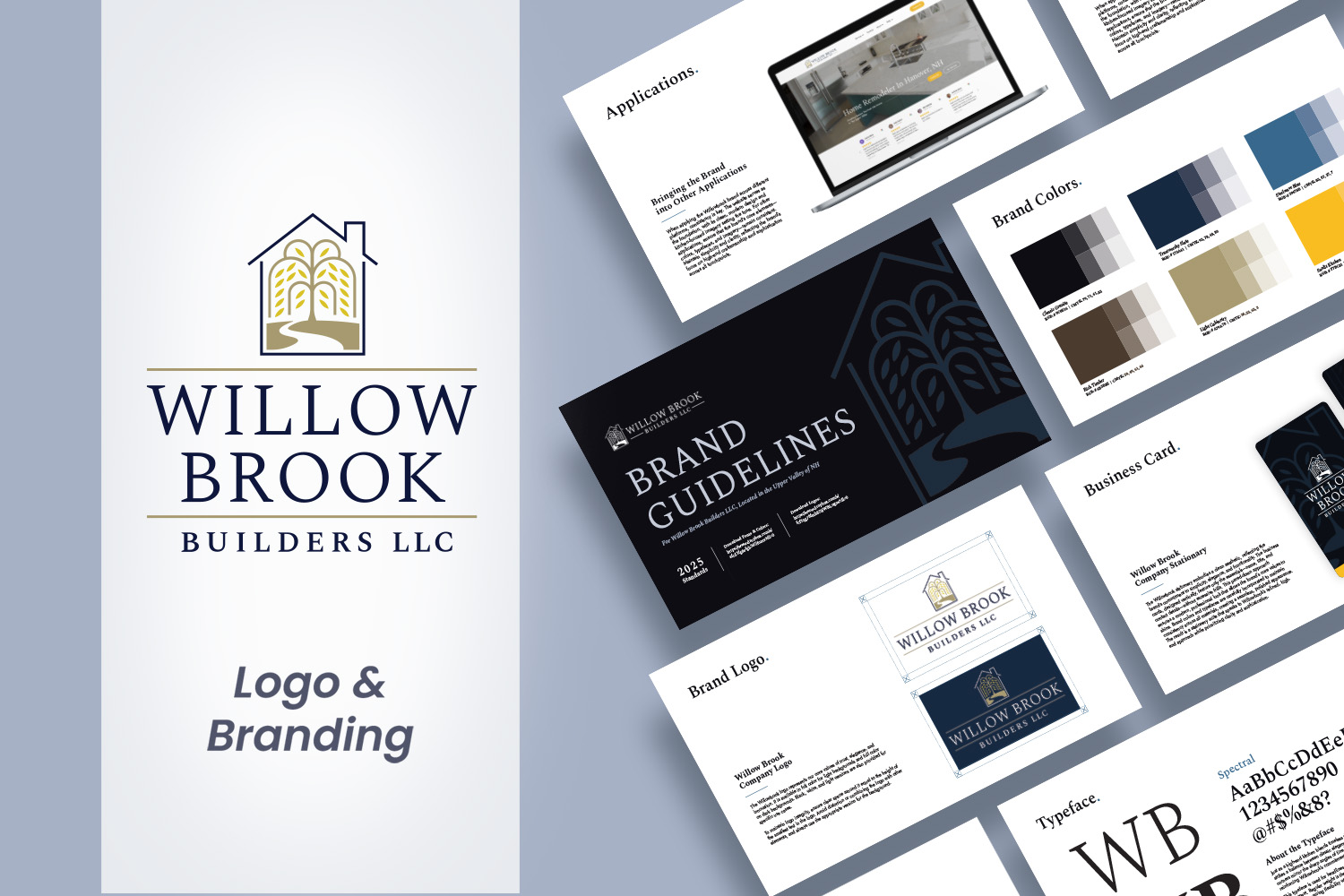
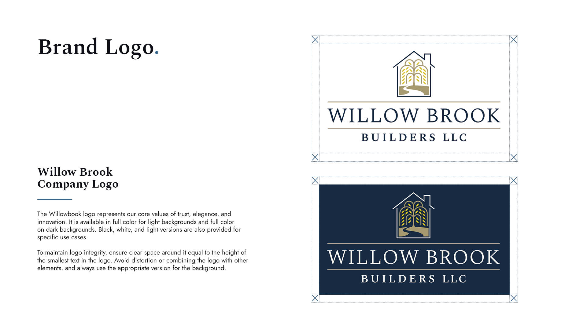
A New Logo for a New Business
PROJECT BRIEF
Willow Brook Builders is a local company dedicated to the highest standards of craftsmanship, integrity, and service. As a newly established business gaining momentum in the post-COVID world, they needed branding that communicated that trust, quality, and professionalism to attract upscale clients. My task was to create a logo that aligned with their mission and values.
After the first sketching phase, I moved onto Drafting out three of the client’s favorite logos, only one car based at the point in time luckily enough.
Make it ‘Like a Car’?
Design Challenges
As quirky as it sounds, one of the original ideas for the logo came from the owner’s love for vintage cars—he wanted the logo to resemble the front of his favorite classic vehicle. While I did create a few drafts along those lines, it quickly became clear that the design challenges lay in working with a client who didn’t quite know what they wanted. This made the process more difficult as the owners struggled to articulate their vision. They could recognize what they liked when they saw it, but providing direction was a challenge. In addition to finding the right aesthetic, the logo had to convey trust and quality while appealing to upscale clients. The project was further complicated by a much smaller budget than I would have preferred for a branding project.
We spent a large amount of time on colors. The owner loved the colors of classic and sports cars but they didn’t go well with the natural theme and client base, so we moved on to blues and browns.
Make it Simple and Elegant
Design Solutions
When clients are uncertain about what they want, sometimes the best solution is to present a variety of ideas and see what resonates best. I created 5 or 6 different logo options, narrowing it down to three semi-finished designs. The first was the vintage car-inspired logo with a hexagonal pattern, as requested. It wasn’t my favorite, and I was relieved when the owner also decided to move away from it. I took the opportunity to explain that while vintage cars may appeal to some, the high-end kitchen and cabinetry clients they were targeting likely wouldn’t connect with that aesthetic. My other options were simpler and more direct—one featured a monogram-style WB/WBB logo, and the other incorporated a willow tree, brook, and house. Initially, the client wasn’t sold on these concepts, but after showing them to a few clients and his wife, who all loved the designs, he realized the appeal. The “Willow Brook House” logo was a hit, especially with the female clients who often made decisions on kitchen, finishing selections, and the companies that provide them.

A Return Customer
OUTCOME AND REFLECTION
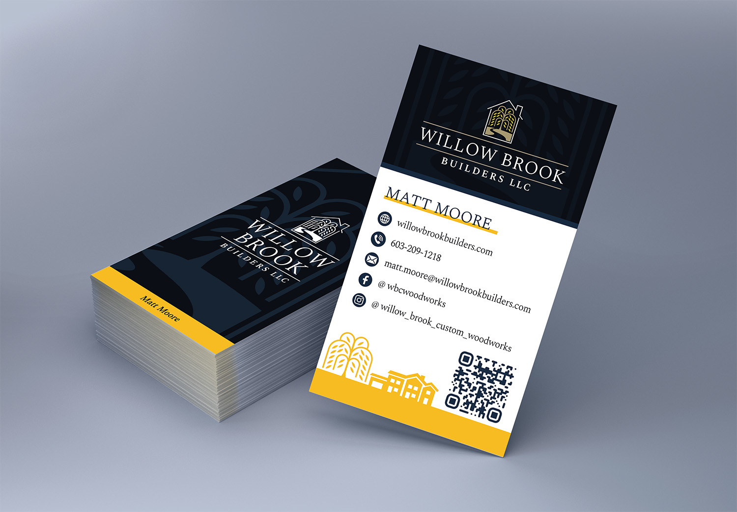
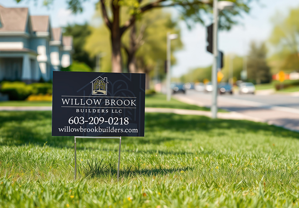
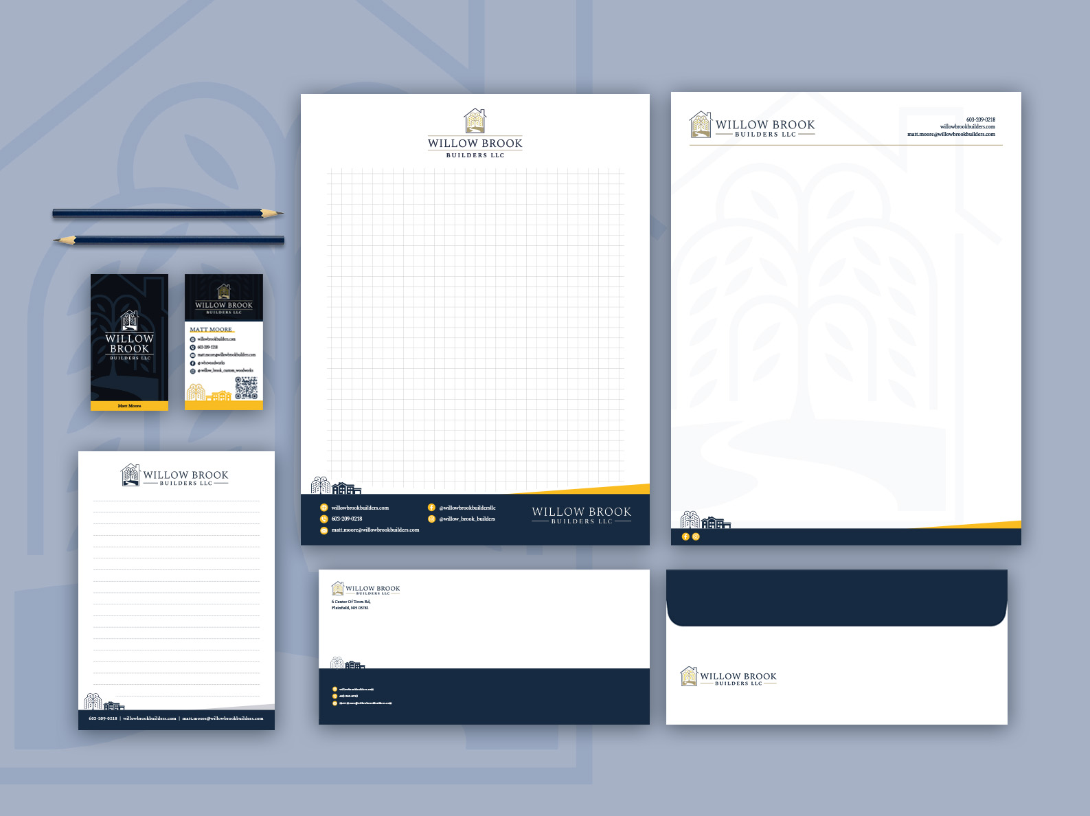
After the branding was complete, Willow Brook Builders returned for additional design work, including business cards, signage, truck decals, and more. The company has since grown, with an expanding team, and it’s clear that the new logo is helping to solidify its professional image.
Although I’m happy with the final product, I do wish I’d had more time to refine the logo. The project was initially allocated only six hours of design time, much of which was spent exploring vintage car aesthetics rather than honing the final design. While the Willow Brook logo works well within the category of “on-the-nose” homebuilder logos, I believe I could have made it that 10% better to stand out with a little more time.
One key lesson I took away from this project was learning how to politely guide a client when their ideas aren’t in line with the brand they’re trying to build. I didn’t save many of the car-inspired drafts, but they were clearly headed in the wrong direction for a luxury kitchen and finish business. By taking the leap to explain why the two didn’t mesh, I was able to earn the client’s trust, and ultimately, we ended up with a solution that better represented their brand.